ALPHABETS
a Manual of Lettering lor
the use o f Students with
Historical and Pra&ical
Descriptions
W ith 200 Illustrations
*
ue maria
g f a plena
bominuô
recti bene
Meta m in mulicrtb*
etbenebictue frncf’
uentris tui : ibefue
cl):iftuô amen.
ALPHABETS. A MANUAL
O F L E T T E R I N G F O R T H E U S E O F S T U D E N T S , W IT H H IS T O R IC A L A N D P R A C T I C A L D E S C R IP T IO N S , B Y E D W A R D F. S T R A N G E SECOND EDITION WITH 2 0 0 ILLU STRATIO N S LONDONGEORGE BELL AND SONS
YORK STREET, COVENT GARDEN
I^F
00
6 2 6 3 8
C H IS W IC K P R E S S :— C H A R L E S W H IT T IN G H A M A N D CO. TO O K S C O U R T , C H A N C E R Y L A N E , LO N D O N .
P R E FA C E.
H E alphabet is so closely linked up with our everyday life, that its very familiarity causes it to be, in a measure, overlooked and neglected as a serious study. With the exception of the very partial revival of 1845-55, from which the names of the younger Pugin and Owen Jones are inseparable, our designers have been content, until quite re cently, with letters whose only characteristic was their uninspired conventionality. The chief text books at all generally used have been those pub lished by Henry Shaw (1845), Delamotte (1864, 2nd edit.), and Messrs. Newbery and Alexander. The author has had exceptional opportunities of observing the extent to which these have been drawn on, as well as the directions in which they failed to satisfy the requirements of their audience. When the subject was suggested as one which might well be included in the “ Ex-Libris ” series, it was at once apparent that a treatment might be planned to appeal not only to book-lovers, but
also to a large clientele of artists and craftsmen, who desired, not so much an assortment of the curiosities of lettering, as a practical handbook which should give them both accurate historical information and references for further study, with especial consideration for the technical qualities of the alphabets figured, and their suitability to various materials and uses. This dual purpose has been steadily kept in view throughout the present volume ; perhaps, it must be said, with some leaning to the practical side.
It is not pretended that this book is, in any sense, a manual of palaeography. Such historical notes as were necessary to insure a proper con sideration of the examples given, with due regard to the circumstances under which their originals existed, have been compiled with care from good authorities. But it has been felt that this side of the question belonged more properly to those scientists and archaeologists whose splendid results are already, in one form or another, before the world; and that for the audience to whom we appeal, it were better to treat the subject from the standpoint of beauty and utility, rather than that of historical value or antiquarian research.
For this reason Greek characters have been excluded ; while the examples given will, it is hoped, be found in every case to be of actual value, either as offering suggestions for new de partures, or as affording authority for the revival of valuable but forgotten forms.
On going more fully into the matter, the material from which selection had to be made was found to
VI
1
be immense ; and it became inevitable that certain whole classes of writing should receive merely a passing mention. Thus, the charter-hands of the middle ages are represented only by some of their most legible forms, while both personal hand writing, and the numerous models therefor by writing-masters of later date, have had to be almost entirely disregarded. Typography also has by no means been examined in detail, although an attempt is made to illustrate all its more im portant phases ; this subject, as well as that of the ornamentation of letters, demanding special treat ment quite impossible within our limits. In each of the foregoing instances, however, the list, of references given will be found to supply a quite adequate introduction to further study.A s regards theory, an endeavour is made to formulate certain broad principles on which the student may work, both as regards the making of letters and their application to practical use ; and for his sake, also, some of the snares and errors to which a beginner is liable, have been pointed out.
The preparation of this book has been a task of extreme pleasure to the author; and with one single exception, he has received from everyone with whom it brought him in touch, not only passive courtesy, but an amount of active assis tance which it is difficult to acknowledge adequately in mere words. Its inception was due to the editor of the series, who has throughout its execu tion bestowed upon it such care and thought as an author rarely has the good fortune to meet with.
Many suggestions reached me which want of space alone prevents my using in this, the second edition. It would have been desirable, had cir cumstances permitted, to have included specimens of the admirable lettering of Messrs. Abbey, Anning Bell, Heywood Sumner, Howard Pyle, and several other designers. But my intention has been to suggest means and methods of study, rather than to sit in judgment on contemporary effort ; the works of these artists are largely in the hands of the public to which I appeal ; and if that public has not the taste to appreciate their beauties, I can only regret it.
Similarly, it seems well to explain that the ex amples of lettering applied to various crafts are given as suggestions which may be considerably developed in every instance ; and also that the American types represented herein are not chosen as examples of perfection, but as interesting attempts to produce new forms on more or less legitimate lines. A s a rare instance of good modern work of its kind, reference might certainly have been made to the medals and plaques by M. Oscar Roty. The fine lettering of monu mental brasses, moreover, affords material almost enough for a special monograph ; but, on the whole, the student can, with so much ground wherein to work, surely be left to the delights of his own explorations.
For the rest, a few obvious errors are now corrected ; and it remains only to thank everyone concerned for the kindness and courtesy with which my efforts have been received.
To Messrs. Walter Crane. Sehvyn Image, C. F A. Voysey, Charles Holme, York Powell, and Miss Alice B. Woodward, I am indebted for original drawings made specially for this book.
For material supplied, my thanks are due to Messrs. Grevel, B. T . Batsford, Cassell and Co., Limited. Mr Elkin Matthews, and the editors and publishers of the “ Antiquary ” and “ Building N e w s;” while Messrs. Lewis F Day, Maurice B. Adams, F R .I.B A., A. Whitford Anderson, A .R .I.B .A ., and A. N. Prentice, A .R .I.B .A . have kindly allowed the reproduction of specimens of their lettering. For personal assistance, my acknowledgments are very heartily given to Messrrs. H. D. Clifford and W. Giles, for great care and untiring work in connection with the illustrations; to Messrs. F York Powell, G. R. Redgrave, and W H. Jam es Weale, for many valu able suggestions ; to the latter gentleman, with Messrs. G. H. Palmer, C. P. Macaulife, H. Portch, and L. W. Micheletti, of the National Art Library, South Kensington, as well as to Mr. W. W. Watts, of the Museum, for practical help in many direc tions ; and to the authorities of that institution for the facilities my artists received in their work.
The reproductions from the specimen sheet of Erhard Ratdolt are from a proof kindly supplied by Dr. Conrad Burger to the Bibliographical Society for Mr. Redgrave’s monograph on that printer ; and I am indebted for it to the courtesy of Mr. A. W. Pollard, the Hon. Secretary of the Society. E d w a r d F. St r a n g e.
South Ke n sin g t o n Mu s e u m, Jan., 1896.
C O N T E N T S . C H A P T E R P A G E I. Rom an Le t t e r i n g a n d it s De r i v a t i v e s . . i II. Th e Mid d l e Ag e s... 27 I I I . Th e Be g i n n i n g o f Pr in t e d Le t t e r s . . . 5 4 I V . Le t t e r s in t h e Si x t e e n t h Ce n t u r y . . . 78 V . Th e Se v e n t e e n t h Ce n t u r y... 14 5 V I. Th e Eig h t e e n t h Ce n t u r y...16 6 VII. Th e Ni n e t e e n t h Ce n t u r y... 18 8 VIII. Th e Ma k in g o f Le t t e r s...2 24 IX. Th e Pl a c in g of Le t t e r s: so m e Pr i n c i p l e s. 2 5 3 In d e x...2 g 9
L I S T O F I L L U S T R A T I O N S .
PAGE
Ave Maria, from the specimen sheet of Erhard Ratdolt of A u g sb u rg ...Frontispiece Alphabet. Roman Capita's from inscribed tablets
Alphabet. Roman Uncials from a MS. (sixth century). Inscription on a Roman Tablet, Binchester, Durham . Roman Capitals and Uncials from a papyrus MS. (sixth
century)...
Alphabet. Roman Rustic Capitals from a MS. Virgil (fifth century)...
Latin Writing of the seventh century . . . .
Roman Inscription on a pig of lead found in England (from the “ Antiquary”) ...
Alphabet. Roman Half-uncial from a MS. . .
Lombardic Writing, Monastery of La Cava (thirteenth century Alphabet. Lombardic Capitals (thirteenth century). . . Alphabet. Lombardic Minuscule from a MS. of the Monas
tery of La C a v a ... • Visigothic Writing (tenth century)... Book of Kells, a page (eighth c e n t u r y ) ... Alphabet. Irish Uncials from the Book of Kells . . . Anglo-Saxon Writing .(seventh century)... Gospel of St. Cuthbert, Anglo-Saxon, a page (seventh century Alphabet. Square Capitals, Anglo-Saxon (seventh century) English Writing (eighth c e n t u iy ) ... Alphabet. Anglo-Saxon Capitals from the “ Rule of St
Benedict ” (sixth c e n t u r y ) ... Manuscript (portion). Caroline, Tours (ninth century) . Alphabet. Versal Letters from MSS. (tenth century) . Alphabet. Initial Letters (tenth century) . . . .
7 8 10 11 12 14 16 17 18 22 23 24 25 28 29 30
PAGE Alphabet. Initial Letters (thirteenth-fourteenth century) . . 32 Alphabet. Initial Letters (ninth c e n tu r y ) ...33 Alphabet. Versal Letters (twellth century)...35 Alphabet. Lombardic Letters from an incised slate monu
ment (Belgium, a.d. 1 2 9 ') ) ...36 Alphabet. Lombardic Letters from an incised brass (Sweden,
A.D. 1327) ...37 Alphabet. Gothic Capitals and Minuscule from a MS. (a.d.
i '36) ...: ... . . . . • • • • 38 Alphabet. Roman Capitals from a MS. (Spain, eighth cen
tury) ... 39 Alphabet. From a MS. (Spain, twelfth century)... 40 Alphabet. Lombardic Letters from a Seal (Spain, A.D. 1383) 41 Inscription (dedicatory) of the Cathedral of Toledo. Drawn
by C. Rodriguez (Spain, seventh century)... 43 Diplomatic Whiling. From a French deed dated a.d. 1119 . 44 Alphabets (two). Capital and Small Letters, English Chan
cery hand (from W right}... 45 Alphabet. English Capitals from the Tomb of Henry III.
in Westminster Abbey (a.d. 1272, c . ) ...46, 47 Numerals (twelfth-fifteenth centuries)...48 Alphabet. Gothic Minuscule from a MS. (Italy, fourteenth
century)...48 Alphabet (portion) Gothic Capitals from the Tomb of
Richaid II. in Westminster Abbey (ad. 1400, c.) . . 50, 51 Alphabet. Capitals from the Font (cast brass) at Hildesheim
(A.D. 12C0)... 53 Block-book (Donatus), portion of a page (fifteenth century) . 55 Flemish Writing (fifteenth century)... 56 Capitals (fifteenth century)... 57 Type (drawing from) used by J. Gutenberg (fifteenth cen
tury) ... 58 Alphabet. Gothic lower-case, from types of Peter Schaeffer
( 1 4 7 5 ') ... 59 Type. Nicolas Jensen (fifteenth c e n tu r y ) ...61 Type. Gothic Letters. Erhard Ratdolt ( i4 8 6 ) ... 62 Title page. Jacobus Philippus Foresti (Bergomensis) De
Claris Muheribus (Ferrara, 1497)...63
Type. Jacobus Philippus Foresti (Bergomensis). (Ferrara, 1497) . • • • • . ... ... ...65 Type. Friburger, Gering, and Crantz (Paris, A.D. 1475) . . 66 Printer’s Mark, Thielman Kerver (Paris, A.D. 1500, c.) . . . 68 Printer’s Mark, Jehan Petit (Paris, A D. 1500, c . ) ... 69 Type. Ulric Tell (Cologne, A D. 1 4 7 3 ) ...70 Type, with printed flourishes (Nuremberg, early sixteenth
century)... . - ... 71
xiv
L ist o f Illustrations.
L ist o f Illustrations.
X VPAGE
Alphabet from a Spanish MS. (fifteenth century)... 72 Alphabet and Numerals from an Italian MS. (fifteenth century) 73 Alphabet. Lombardic Letters and Printed Books (fifteenth
century)... 75 Alphabet. Italic Type-letters, written by F. Lucas (Madrid,
A.D. 1 5 7 7 ) ... 79
Alphabet. Imperial Charter-hand Written by G. A. Tagliente (Venice, A.D. 1524)... 81 Alphabet. Flemish Letters (open letter). Written by J. B.
Palatino (Rome, a.d. 1 5 4 5 ) ...84 Alphabet. Lettera Moderna. Written by J. B. Palatino . . 85 Alphabet. Papal Chancery-hand. Written by J. B. Palatino 87 Alphabet. Pontifical Capitals by Geoffroy Tory (Bourges,
A D. 15 2 9 ) ... 89 Alphabet. Chancery-hand Capitals. Written by J. B. Palatino 90
Alphabet. Commercial-hand, Capitals. Written by J. B. P a l a t i n o ... 91 Alphabet. Lettera Francese. Gothic lower-case, with inter
lacements. Written by J. B. P alatino...93 Alphabet (portion). Capitals in interlaced line. Written by
Vicentino (Rome, A.D. 1523)...95 Alphabet. Lettera Bastarda. Written bv F. Lucas (Madrid,
A.D. 1 5 7 0 ) ... 97
Rcdonditla lia?ia. A page from the writing-book of F. Lucas
(Madrid, A.D. 1570)...99 Alphabet. Round Book-hand. Written by F. Lucas (Madrid,
a.d. 1570)... 102, 103 Alphabet. Type-letters, Roman. Written by F. Lucas
(Madrid, a.d. 1577)...104 Alphabet. Roman Book-hand. Written by U. Wyss (Zurich,
a.d. 1549).- ...io5
Alphabet. Script Capitals. Written by U. Wyss . . . . 107 Alphabet. Gothic Capitals. Written by U. Wyss . . . . 108 Alphabet. Semi-Gothic Book-hand. Written by U. Wyss . 109 Alphabet. Round-hand, small text. Written by U. Wyss . n o Alphabet. Script, small hand. Written by U. Wyss . . . i n Alphabet. Versal Letters. Written by U. Wyss . . . . 112 Alphabet. Lombardic, Capitals. Written by U. Wyss . . 113 Alphabet. Roman open-letter Capitals from a specimen by
U. W y s s ... ...114 Alphabet. Roman Capitals by G. A. Tagliente (Venice, A.D.
I524)... 116, 117 Alphabet. Roman Capitals from the tomb of the Emperor
Henry VII., in the Duorno, Pisa (a.d. 1315, c.) . . 120, 121
Alphabet. Mixed Capitals from the Font of San Giovanni, Siena (a.d. 1 4 3 0 ) ... 122, 1 2 3
PAGE
Inscription (cast bronze) from the tomb of the Margravine of Brandenburg, by Peter Vischer (Nuremberg, sixteenth century)...124 Tablet in Della Robbia ware, with arms of Simonetto di
Chorso, S.K.M. (a.d. 1 5 1 2 ) ... 125 Alphabet. Roman Capitals, etched on a background of orna
ment by D. Hopfer (Nuremberg, sixteenth century) . . 127 Inscription from Inscrittioni del Sisto V., engraved by Lucas
Fanensis (Rome, 1 5 8 7 ) ...129 Alphabet. Italic Capitals engraved by Antonio Sacchi (Rome,
a l). 1605, c ) . . . ... 131 Alphabet. Roman Capitals engraved by A. Sacchi . . . . 132 Alphabet. Roman lower-case Type-letters, engraved by A.
S a c c h i ... 133 Inscriptions (four) from Italian majolica drug-pots, S.K.M.
(fifteenth-sixteenth ce n tu ries)...134, 135 Inscriptions from enamelled terra-cotta plaques ascribed to
Luca Della Robbia, S K.M. (a.d. 1465, c.)... 136 Motto of King Réné of Anjou. Made in enamelled terra
cotta by Luca Della Robbia, S.K.M ... 137 Majolica Plate of Pesaro or Gubbio ware, S.K.M. (a.d.
1490-1500)... • • • • . ...>38 Inscriptions (three) from Spanish (Valencia) majolica plates,
S.K.M. (sixteenth cen tu ry)... 139 Alphabets (two) of Ribbon Letters by Caspar Nef (Cologne,
a.d. 15 4 9 ) ... •...140, 141 Figures from DtirePs engraving, “ Melencolia ” ...142 Alphabet (portion). Ribbon Letters from a Brass in the
Church of St. Peter, Cologne (a.d. 1 5 0 6 ) ... 143 Alphabet from a tombstone in Abercorn Churchyard,
Scotland (fifteenth century)... 146 Inscription on a dormer window, Byers Close, Edinburgh
(sixteenth century)... 147 Inscription from monument in Greyfriars Churchyard, Edin
burgh (seventeenth century)... 148 Inscriptions from lintels in Edinburgh (sixteenth century). . 148 Alphabet from bells cast by Richard de Wymbish, London
(early fourteenth c e n t u r y ) ... 149 Lettering from the tomb of Henry III., Westminster Abbey
(A.D. 1272, c ) ...150 Alphabet from English bells (early sixteenth century) . . . 151 Flagon (with a word). English Sellfounders’ work, Norfolk,
S.K.M. (A.D. 1330-1350, c . ) ... ...153 Inscription from a Dutch mortar, cast bronze, S.K.M. (seven
teenth ce n tu ry )...154 Warming-pan of the Earl of Essex, S.K.M. (A.D. 1630). . . 155
xvi
L ist o f Illustrations.
L ist o f Illustrations.
X V I 1PAGE
Inscription. Brass open-work, German, S.K.M. (a.d. 1595) . 156 Inscription (wrought-iron open-work) from a Spanish Screen
formerly in the Cathedral of Avila, S.K.M. (A.D. 1490) . 156 Date, 1681, from a Dutch cannon, cast bronze, S.K.M. . . . 157 Compartments, with dates (four), from English furniture,
S.K.M. (seventeenth cen tu ry)... 157-159 Alphabet. Gothic small text. Written by Edward Cocker
(a.d. 1672)... 161 Date, 1692, in wrought-iron open-work, S.K.M ... 163 Medal by Vittore 1’isano, S.K.M. (fifteenth century). . . . 164 The Great Seal of the Protector Richard Cromwell (a.d.
1658-1659)...164 Date, 1539, on a brass “ repousse” Dish, German . . . . 165 Type. Petit Canon. J. Enschedé, Haarlem (a.d. 1744) . . 167 Type. Modern “ Caslon ” ...168 Type. Page from the specimen-book of W. Caslon (a.d.
1766)... 169 Type. Modern “ Caslon ” Small C a p it a ls ... 170 Type. Specimen from “ Edwin and Emma,” printed by
J. Baskerville (A.D. 1760)... 171 Type. Specimen cut by A. Wilson, Glasgow (a.d. 1778) . . 174 Type. A page from the specimen-book of J. Enschede,
Haarlem (A.D. 1 7 4 4 ) ... 175 Type. Specimen of Flemish “ Gothic,” by J. Enschede . . 176 Type. Flemish Capitals from the specimen-book of J.
E n sc h e d e ... 177 Type. Specimen, Italic and Roman (Copenhagen, a.d. 1774) 178 Type (Roman) from the specimen-book of G. B. Bodoni
(Parma, a.d. 1 8 1 8 ) ...179 Type. Capitals by G. B. B o d o n i... 180 Alphabet. Square Text and Secretary. Capitals and small
Text (English, a.d. 1733)...182 Sub-title from Ware (R.). “ The Young Clerk’s Assistant,” etc.
(A.D. 1733) . _ ... 183 Alphabet. Gothic small text. Written by Jan Pas (a.d.
1737) ... ’ ... 184 Numerals written by Jan P a s ...185 Inscription, drawn by M. B. Adams, F.R. I.B.A., from a monu
ment in Ledbury Church (“ Building News,” April, 1885) 186 Tablet on a Cottage near Folkestone, drawn by Warrington
Hogg ...187 Alphabet (script), written by Pasquale Paillasson (a.d. 1796). 189 Alphabets (two). Caractères de civilité. Capitals and small
text from French types (a.d. 1 8 1 9 ) ... 190 Alphabets (three). Gothic Capitals and small text, by A. W.
X V I11
L ist o f Illustrations.
PAGE
Illumination, a page of the “ Song of Solomon.” Written by Owen Jones (London, a.d. 18 4 9 )... 193 Alphabet. Double Roman Capitals, by Caspar N ef. . . . 194 Type. English “ Fancy ” (nineteenth c e n t u r y ) ...195 Type. Am erican... 197-203 Type. Modern “ Old-faced” ...204 Modern Irish T y p e ... 204 Type. Modern Old Frenc.) C apitals... 205 Type. Modern “ Old-face Italic ” ... 205 Type. Modern “ Caxton ” ... 206 Title-page, by Herbert P. Horne . . . to face 206 Title-page. Shakespeare, “ Two Gentlemen of Verona.” De
signed by Walter C ra n e ...207 Title-page of “ The Knight Errant,” by B. G. Goodhue . . . 210 Title-page. Spenser, “ The Faerie Queene.” Designed by
Walter C rane... 212 Title-page. Shakespeare, “ The Merry Wives of Windsor.”
Designed by Walter Crane ( 1 8 9 4 ) ...213 “ The Sirens Three.” A verse written by Walter Crane
( 1 8 9 4 ) ... .. • • • ' ...2I4 Alphabets (two) and Numerals. Designed by C. F. A. Voysey 215 Cover. Designed by C. F. A. Voysey...217 Nursery Rhyme. Ornamental lettering, by Miss Alice B.
Woodward ( 1 8 9 4 ) ... 219 Alphabet. Designed by Selwyn Im a g e ... 220 Alphabet. Designed by Charles Holme...221 Alphabets (two). Designed by Professor York Powell . . 222, 223 Scribes writing from Dictation. From an Italian woodcut
(fifteenth c e n tu ry )... 225 A Scribe at Work. By U. W v s s ...227 Writing Materials, a trophy of (Venice, A.D. >524) . . . . 230 Pens, quill. Drawn from the “ Schreibkiinst ” of A. Neudorffer
(Nuremberg, A.D. 1 6 3 1 ) ... 233 Methods of holding the Pen. From U. Wyss (Zurich, a.d.
>549) ...235 Letter O. By Geoffroy Tory (Paris, 15 2 9 ) ...238 Letter Y. “ La lettre Pythagoricque,” by Geoffroy Tory . . 240 Monogram, showing construction. By G. A. Tagliente . . 241 Alphabet. Gothic small text. A. Dürer, “ Geometria” (a.d.
>525)- ...244 Alphabet (with construction). Gothic small text. By A. Dürer 243 Alphabets (with construction). Roman Capitals. By A.
D ü r e r ... 246-250 Alphabet (with construction). Gothic Capitals. Written by
L ist o f Illustrations.
xix
PAGE
Alphabet. Initial Letters from MSS. (thirteenth-fourteenth centuries)...255 Versai and Capital Letters. From mediaeval M SS... 257 Dedicatory Inscription. From an Italian incised stone,
S.K.M. (a.d. 1293) ...259 Title-page. Missal of St. Benedict (German, fifteenth cen
tury) ... 263 Title-page. Modern A m erican...265 Title-page. By A. N. Prentice...to face 267 Title-page. The Columbian Ode. Designed by W. H.
Bradley (1893) . 267
Type. Italian (fifteenth c e n tu ry )... 268 Label for an Architectural Drawing. By A. N. Prentice . . 269 Trade-card. Modern American... 270 Portrait of Ulric Varnbiiler, with inscription. By A. Dürer
(A.D. 1522)... 271 Design for the cover of the Magazine of Art.” By Lewis
F. D a y ...273 Invitation Card (Fellowcraft Club). Modern American . . 274 Inscriptions (three) on Tapestry, S.K.M ...274-276 Inscription on Embroidery, S.K.M ... 276 Monumental Brass, with inscription, in the Béguinage at
Bruges (aD. 1380-1410) ... 277 Medal of Ludovico III., second Marquis of Mantua, by
Vittore Pisano, S.K.M . (fifteenth century)...278 Majolica Plate. Gubbio or Pesaro ware (Italy, fifteenth
century)...279 Plaque. Spanish (Valencia) Majolica, with inscription . . 280 Inscription on the edges of the leaves of a book (France,
sixteenth ce n tu ry )... 281
Note.— The objects marked “ S.K .M .” are in the South Kensington Museum.
A L P H A B E T S .
C H A P T E R I.
ROMAN LETTERIN G AND ITS DERIVATIVES.
F all the evidences of ancient—one might almost say, did it not seem to involve a contradiction of terms —pre-historic civilization which have remained to us, none is so complete, so unaffected by ages of tradition, and so absolutely in its original relation to surrounding humanity, as the little group of alphabets which to-day forms the staple means of expression of the intellectual world.
At the outset of this study, it must be clearly understood that the forms of letters are due to a convention only— but one imposed by the greater intellect on the weaker, with such convincing power as to have all the force of a law, without the sense of restraint and tendency to rebellion which arti ficial legislation so often produces.
In their inception, letters were to a considerable
extent pictorial; sufficiently so, at all events, to link them with certain well-known objects, the popular representation of which, in ornament, was already practically invariable. The group of alphabets under consideration derives its origin indirectly — but undoubtedly — from Egyptian hieroglyphics ; the crude attempts to express thoughts, or rather, in the first instance, to record facts, by means of a series of pictures. It was in evitable that these elemental pictures should, especially in the hands of the Egyptians, become strictly conventionalized ; and also that they should gradually assume the quality of syllabic signs rather than of ideograms ; a transition which may have been helped somewhat by secretive ten dencies on the part of the priests. In this second stage of development, signs seem first to become connected with sounds ; a natural association, when both the resemblance to, and sole connec tion with a concrete object had been lost.
The final stage produced alphabetical signs re presenting elementary sounds, and so far the Egyptians progressed ; the hieroglyphs selected by them for this purpose being, in their cursive or written form, the “ source of all existing alphabets.” 1
Without entering into the various theories of evolution propounded at one time or another, it may be shortly stated that modern paleologists have practically agreed that our letters for the
1 Taylor, “ The A lph abet” (London, 1883), vol. i., p. 5 ; where an exhaustive inquiry into the origin o f the various alphabets may be found by those who wish to go deeply into the subject.
Roman Lettering and its Derivatives.
3
most part find their origin in the conventions promulgated for their own convenience by the Egyptian priests (the so-called “ Hieratic” script) ; and successively develop through the Phoenician,
A B C D
E F C H
I L M N
0 P Q R
S T V X
I. ROMAN CAPITALS CARVED IN STONE.and the dialectical varieties of Greek towards the Eubcean form, which latter, being transplanted into Sicily and Italy by colonies from Chalcis, be came the immediate parent of the Roman letters, and practically remains with us to this day.
4
A Iphabets.
The oldest forms of Latin lettering are those of majuscule writing; comprising square and rustic capitals on the one hand, and uncials on the
A.
B C Ó
c j7 c ;
n i
l
m
M
O
p q
r
s
t
u
x
other. The square capitals followed, it will be seen on reference to fig. i, the lines and propor tions so well known ever since; the external angles are invariably right angles, and the curves regular and symmetrical. This alphabet is essen
tially the ideal one for inscriptions in stone on a grand scale. Its use for this purpose crystallized its forms in the first instance, and with its absolute simplicity, directness, and intelligibility, its mathe matical rigidity of proportion and boldness, it remains to this hour a characteristic monument of the grandest period of the Roman nation.
When used in manuscripts, the letters naturally acquire a somewhat different character, becoming more fanciful—or at all events, flexible— as they
Roman Lettering and its Derivatives. 5
respond to the unequal pressure of the reed. In some specimens one already notices a tendency to prolong the F and L, even in their “ capital ” form ; doubtless to distinguish them from the E in one case and the I in the other.
The manuscript form of these capitals has received the curious name of “ Rustic ” writing, by a palpably absurd and childish analogy with a form of ornament which still occasionally flatters the bad taste of provincials. Its characteristics are not widely different from those which the
❖ c v fy SN0NVID1T
1
Tsl C O
r!"> O c n ils j T s
Roman Lettering and its Derivatives. 7
tion due to a flexible instrument might lead one to expect; but these variations are so constant as to constitute a distinct and easily recognizable style. A s has already been pointed out, the F and L are somewhat elongated; a few letters, as E, X, S, C, have a tendency to become narrow in proportion to their height; the finials have a decided curve, which is also traceable in the body of the letters R, U, M, S, C, etc. ; while the
rectan-AlCDtlGtCl
M N
0
1
a?
M V X Y '
5. RUSTIC CAPITALS (FIFTH CENTURY')•
gular principle is still maintained, the limbs of the letters showing little tendency as yet to widen out.
There are, however, several details which may be noted as peculiar to, and characteristic of this style of writing. The A has no cross-stroke, and its second limb is very oblique and thicker than the first, which is nearly perpendicular, and joins its fellow below the top of the letter. U is formed by two strokes, of which the second is per pendicular, and has a tendency to prolongation below the line of writing, a form which persisted at all events as late as the ninth century, and is
m
C
IP
lV
N
T
-t
£C
T
1 0N
eS
M
N
V
iq
i
F R O M A LATI N M S. (SEV EN TH CENTURYconnected with the more modern letter Y ; and the loop of the P is slightly open on its lower side.
This writing is very regular and evenly spaced out; but without, in early examples, any delimita tion of the words, punctuation being by phrases or sentences only. The stops used are the comma, in its modern form and place, and the full point placed always well above the line, often on a level with the tops of the letters. ,
Many of the most beautiful of the early Roman manuscripts remaining to us are in this character, which was evidently estimated at a very high value and used accordingly for important works. A welbknown work in this script is the Medici “ Virgil ” in the Laurentian Library at Florence, concerning the acquisition of which many tales have been told ; among others that it had been stolen from the Vatican Library at Rome. The facts of the case are concisely given by Silvestre (vol. ii.), and are as follows. About the middle of the sixteenth century, the manuscript belonged to Cardinal Ridolfo Carpi, a contemporary of Pope Paul III. Thence it passed into the hands of the Cardinal del Monte, from whom the Grand Duke Cosmo I. acquired i t ; sending to negotiate on his behalf Baccio Baldini, his librarian. A copy of the letter written on the occasion to the Cardinal is still extant, bearing date 24 January, 1567 ; and by such perfectly legitimate means the treasure passed into the custody of Florence, where it has since remained. There is no evidence of its having ever belonged to the Vatican.
Its authenticity and date are also beyond ques tion; an inscription at the end of the “ Bucolics,” in a different hand to the manuscript itself, bearing witness that this copy of Virgil had been revised and corrected by Turcius R ufus Apronianus
A steriu s: a common proceeding undertaken
usually very soon after the completion of the copy. A s Apronianus Asterius was consul in 494, this places the date with sufficient exactitude.
The complete alphabet (fig. 5) is taken from a fragment of a manuscript of Sallust in the Vatican, ascribed also to the fifth century.
io
Alphabets.
7. STAMPED INSCRIPTION ON ROMANO-BRITISH PIG OF LEAD.
Although this style of lettering is not without a certain quaintness and interest, it is likely to be of little practical value in the present d a y ; yet it may be found perhaps to offer some suggestions to a student. But as, with the heavy square capitals, it formed the foundation out of which arose all the beautiful curved forms of the later Roman and medieeval periods, it has seemed worth while to refer to it in some detail.
Uncial letters are, as far as evidence goes, nearly contemporary with the rustic capitals just described. They first made their appearance in
Italy, in some solitary cases, about the second century a.d., but did not come into general use until the fourth.
On a reference to the complete alphabet given (from a Latin Bible of the sixth century), it will be seen that the forms are in the main based on those of square capitals, but with wide differences in the cases of the letters a , d, e, Jl, m , which constitute the characteristic, or “ test,” letters of the style. Early uncial alphabets are severely simple in construction—essentially the outcome of
a h c d e- p
h i k l
t o
”
v io p q
f t a
j< z8. HALF-UNCIAL LETTERS.
a firm and bold use of a soft reed or quill, with which they can best be reproduced. But, the curve once introduced, was of itself bound to sug gest ornamentation ; and although the style kept its own distinctive character, it became more varied and irregular, losing much of that directness and simplicity which is its chief charm.
An outcome of the preceding is the so-called H alf-U n cial writing, of which we give an example, as beine arain of historical rather than artistic value (fig. 8). The shape and setting up of the letters are much changed, and the development of
many later forms can easily be traced, notably T and G with the tail below the line. The linking up of adjacent letters is also interesting.
In due sequence of development it would be necessary at this point to undertake an examina tion of the various cursive scripts which the
12
A Iphabcts.
dLtcv
c ule n d
>i
cr
u \ I1 ;
»itiTiitf fttui& t
ruk__
\ r
v ’
..f * »
in te rre d
c \ x u > \itu ;{
cckrrLL n tS tiu f w d
s
1
gf?___
9. l.OMBARDIC WRITING, MONASTERY OK I .A CAV.i (t h i r t e e n t h c e n t u r y).
gradual growth of literature and spread of educa tion produced ; but although of intense interest, indeed indispensable to the paleologist, they are not of sufficient value to a designer to merit his attention. It must suffice to point out that, as with the very beginnings of the alphabet, many of the most characteristic forms have been arrived at, not by derivation from the classic forms of
capitals, but by the everyday experience of cursive writing— involving a natural tendency to the sur vival of the most convenient.
The first great advance in this direction was the habit of linking the letters together, which began perhaps with the formation of certain com binations—monograms in fact—in the writing of rustic capitals. With a running hand this practice became a necessity, and had its consequence in the production of loops in letters with limbs above or below the line; and the two shapes of the letter e, one derived from the capital, the other a two- stroke combination, which has lasted till to-day in German script; m and n assumed also their later minuscule forms, being simply produced by linking the four or three strokes (I I I i, I I 1) at first used in cursive writing, while r and s also developed, under these circumstances, their well-known dual forms.
In the fifth century we note the first appearance of that class of stiff formal hands devoted to various legal and official purposes, a fuller account of which will be found on p. 42, where the whole series is treated of together.
An important result of the popularization of cursive writing was the final differentiation of capital or majuscule, from small or minuscule letters, and the gradual growth of complete alpha bets of forms exclusively appropriated to the latter. The use of the initial in Roman lettering began about the fifth or sixth century, although to a very much less extent than it reached later; but minuscule forms do not appear before the
A A
3 C De
f < 5 A n 1}
A, CO ? I D B
o
t
a q
D
5w U V
^ y $
&
seventh century, and did not attain importance until the eighth.
By this time Rome had ceased to be the only centre of literature ; and if it had, on the other hand, begun to gain in religion what was lost to it in other matters, that very fact would alone tend, to an expansion rather than a concentration of educational influence. So that with the final de velopment of all writing into the co-existent forms of capital and small letters, we come for the first time face to face with a new and overwhelming power—that of nationality, and it is necessary henceforward to treat of the various alphabets in connection with the localities wherein they existed.
Setting aside for the present, Irish and Anglo- Saxon writing, which require special consideration, we will deal first with the three principal schools arising out of the old Roman texts, the Lombardic, Visigothic, and Merovingian.
Lombardic writing was used first, as its name suggestsqn Northern Italy, but attained its greatest excellence in the twelfth century in the monasteries of Monte Cassino, near Naples, and La Cava, near Salerno. The alphabet given is one of great beauty, and it will be worth while to note the characteristic treatment of the letters a, e, g, m, n, u, the construction of which, and method of grouping, can also be well seen from the facsimile of a portion of a manuscript of the thirteenth century, illus trated in fig. 10. Lombardic writing, at its best, preserves much of the feeling of the good uncials of the sixth and seventh centuries ; it is still curvi linear, although the uneven thickening of the belly
of the curve gives it some distinction, which after wards became a mere distortion, and was finally exaggerated to comparative illegibility.
The second of the minuscule hands, Visigothic, had its home in Spain. It is similar in many respects to the Lombardic style just dealt with— and with the Merovingian, or Frankish, is
note-O C t C b < t
f
-y h t
l
m
n o p
c\
f
v’
f or
a
2 K--a
5 5&
II. FROM A LOMBARDIC MS. OF THE MONASTERY OF LA CAVA.
worthy, from a designer’s point of view only, for the curious tendency to extreme elongation of the limbs of the letters—a tendency which decidedly adds a certain quaintness, and which in special circumstances migdrt still be used with some deco-o rative effect, remembering especially what has been done by Saracenic artists in the same direc tion with Cufic inscriptions (fig. 12).
There now remains for consideration the writing
~ tm iiidü
,Ht£DK METO®
exp
R'N
iitvr
I
ivmi
I
ls
DEVOT IO ATOVe- PIA
'J
c o n r e o & i o
l u m £ n ' a ö r a 'm - f l u v l n l u m m
r
t> m n cim k o m m & n u & w C n c c b n
ktmcmtm'bum • Dfcjuiiaf
pen er) am jja^uultf in.0p£mr6fcj
c c n u o c iL f 'u a r
ctmkul
b \opffwaccirv
j7 fu> 6a a]
ir
D
'f
nut pinmunbo p-dj“
tuunbum ecraaMltuf jjfircacm, •
lu fcn jH caf 'piccarroYv6 ^ i t
i8
Alphabets.
of the Irish and English monks during the periods dealt with above ; a series of alphabets at once among the most beautiful, and— using the word
nom m aniR .
Ccdxi
CLR1C0&- (ecus
^cdcKuucTi bibcncr amirma^
id le r m p a u m Gcarm ^utaisso*
uo£urcr~6i6ciie—* •
•
•
| O itQ u a m CR uapjccK ui i c o j t d
pwiscRurrcrsibi ucfameuaraas
soROTii m ianRcs iicmpf
crE
cuuc juob
dicann escptTtppopBjccm cftcencem
X^seRmitrsibT uddTTiaJcccrneai,*
(g^u p a tu egtrrn Tneanurnssaaiptr"
s o r u t u
^TIlpossueraiiKTipeRacput^
aeius oaousain ipsius-scpipa|=
hlC CSC^pC lUdoORUTIC^D
13. PAGE FROM THE BOOK OF KELLS (IRISH).
advisedly—the most original in the history of calligraphy.
amount of discussion among paleologists; and is even now veiled in some obscurity, perhaps owing to a slight tendency to exaggerate acci dental differences or resemblances in support of one theory or another. It is needless for our pur pose to enter into any detailed consideration of the merits of the controversy, or even to give the heads of i t ; Dr. Maunde Thompson sums up the matter very concisely. He says,1 “ Ireland bor rowed the types for her handwriting from the manuscripts which the Roman missionaries brought with them”— in the fifth century— “ and we must assume that the greater number of these manu scripts were written in the half-uncial character, and that there was an unusually scanty number of uncial manuscripts among the works thus im ported ; otherwise it is difficult to account for the development of the Irish hand on the line which it followed.”
This theory explains the coincidences which are found in a comparison of early Irish with con tinental manuscripts, of so many and varied places and dates. When the model was once arrived at, the Irish scribes, with a conservatism due both to their earnestness and their isolation, carefully preserved i t ; but as they developed a nicety and precision of workmanship which is unequalled in the history of penmanship, they gradually perfected its form on the old lines, with such variations as were of internal and not external origin, into the pure and beautiful lettering of the Book of
1 “ Greek and Latin Paleography,” p. 236. London, 1893.
Kells and other manuscripts of about the same period.
We select as a typical specimen of Irish half uncial writing, an alphabet from the splendid manuscript just mentioned, the copy of the Gospels known as the Book of Kells, now preserved in the Library of Trinity College, Dublin.1 This book,
Roman Lettering and its Derivatives. 21
ijjervcmdi ouanononmeam
W Vt'dcnuon incur, adce-uemair
/ az, P 011 fuenrus yaoem mam ame- hiqijaamcj
J^Koaubnlomuirtniaaclmcuuneniaiuni /dlJtpiaaiTiquedic-iiiuoauioa* uclociccvcuichme
’ nnui r>epecfmmtr sicucpumuscliesmo w'ossnineu sicutrgueimum anuenunc p a is stun escucpoemwi it-aramrconnuuun
Ouiaoblicus sum comedenepanemmeum Q.UOC e- spunais mev adl icsu; otmVm catnn 11 lone- CJitmhS yoccussinn pdliamo solintcluns
15. ANGLO-SAXON WRITING (SEVENTH CENTURY).
which for a long time was attributed to the sixth century, and even to the hand of Saint Columba himself, is now, with every appearance of authenti city, ascribed to the end of the seventh century. It is decorated with initials of marvellous skill and
1 The most useful reproductions of the Book of Kells are in the “ National Manuscripts of Ireland,” vol. i. plates vii.-xvii. (18 7 4 ).
16. A PAGE FROM THE GOSPEL OF ST. CUTHBERT (ANGLO- SAXON, SEVENTH CENTURY).
ingenuity, the study of the ornament and sym bolism of which would alone furnish material for a text-book of considerable bulk ; but the body of lettering, with almost dramatic taste, has been kept in extreme simplicity. An examination will show it to be half-uncial in character; that is, composed of a mixture of uncial and minuscule letters (see above, fig 8), but so perfectly blended that if the
Roman Lettering and its Derivatives. 23
17. SQUARE CAPITALS (ANGLO-SAXON, SEVENTH CENTURY).
experiment be tried of replacing the b, for example, with its pure uncial form, the result will appear quite incongruous—in itself a fair test at any time of the consistency o f style of an alphabet. The forms are without exception quite intelligible, and can be used at the present time without loss of legibility ; of course, in the case of the dual forms of n and s, selection should be made of the modern survivor. The student should, however, note the peculiarities of b, 1, f, z, and et, as also the regu
larity of spacing and extreme reticence in the use of ornamental flourishes or terminations.
This round hand was not the only one used in Ireland in the middle a g e s; there being also a pointed minuscule script, derived from similar sources but much inferior in beauty and modern utility.
In England the art of writing followed the
reli-24
A Iphabets.
■pivtmis
yu]?pli\' otrni\'is
Sttminam CvdioiMOSanv, llltdljrnritv» Im anp Inaynvm Scot
InlMlUbtiao nMnmvni* cvlinirctcf"
meinisrivum 1 libitum up
l8. ENGLISH MS. (EIGHTH CENTURY).
gious movements of the time, and by reason of the settlements of Irish missionaries in this country in the seventh century, the first English manuscripts are practically the same in character as contempo rary Irish work. An example worth referring to is the famous “ Durham Book ” in the British Museum,1 ascribed to Bishop Eadfrith of Lindis- farne, c. 700 a.d.
Roman Lettering and its Derivatives. 25
This writing, however, gradually formed charac teristics of its own, becoming, if less bold, yet more fanciful and elegant; and influenced by French
19. CAPITALS FROM THE “ RULE OF ST. BENEDICT"' (SIXTH CENTURY).
feeling and taste, gradually lost much of its resem blance to its parent types, acquiring a superficial similarity to some of the later Gothic forms (see figs. 15 and 18).
Before leaving the subject of the Irish and Anglo-Saxon mediaeval alphabets, it may be worth while to draw attention to an almost romantic survival pointed out by Taylor.1 The Runic letter thorn p (th) was one gradually incorporated into the Irish alphabet, and persisted up to the eighteenth century in the common abbreviation of the word “ the,” ye. This letter had its origin in the Greek delta, and “ after making the round of Europe by the northern seas, rejoined in England the other letters of the Greek alphabet which had come by the Mediterranean.”
We may here perhaps, for the sake of con venience, note also the survival to modern times of the Irish and Anglo-Saxon alphabets-—a curious instance of the tenacity of tradition, when one con siders the slender amount of current literature by which they might hope to be promulgated : but for which the splendid instinct of nationality native to the Celtic races must of course be thanked. The letters are of much beauty even in the meagre in variability of type; and for aesthetic reasons alone, one is bound to regret that their use is not wider.
26
A iphabcts.
C H A P T E R II.
T H E M I D D L E A G E S .
* the preceding chapter the necessity of completing our notice of the Irish and English schools of writing has led us chronologically somewhat in advance of the subject; but it seemed desirable to include therein all those schools with classical forms, as containing in themselves the beginnings, to a great extent, of what was later to become the dominant fashion both on the continent and in these islands.
In 796 an Englishman, Alcuin, of York, became Abbot of the Convent St. Martin at Tours. A famous scholar, trained in the schools of North umbria (then among the most notable centres of literary culture), and, for the age, widely travelled, he had been selected by Charlemagne as his chief adviser in the great educational revival instituted by that monarch. Under him Tours became espe cially famous for the excellence of its calligraphy, a result called for by the decree of the emperor commanding a general revision of church books;
ÏN C P N T C A H
d i a l o g i c
;
(J[ B) O O uLTiTuöohocr»
N U Cp I V S p C R A l A O C C U R R I T
c x - u d i r ^ ' j y —c v L L u r o d c t c i r o c x r ^ x i M t a i r ^ r u r i b u i ^ L o c u r u r ^ o ( J L b i p u e t l c u r ) d u o d c c c N i M e m < x b •N u t t r o m u t a m c u r ^ c c u t x r U b i o L e u m ( u b e i u P b e K i e ~ d t c n o S J e c n e u i r C r a m p u L L * x . e u m o L e o q u o d b e ^ e d i ^ c r x j L z r t u p e r ^ 2 0. FROM A C A R O L IN E (TO U RS) MS. (N IN T H C E N T U R Y ).a cause of widespread activity among the manu script writers of the empire.
The text introduced by Alcuin was naturally of
The M iddle Ages.
29
English origin ; but, transplanted
A K í v í
to a foreign soil,CD Ö
e
f
g
b )[ K L
CDM N 0
P CI
R S I
U
Y X
Y
z
2 1. VERSAL LETTERS (TENTH CENTURY).
and developed by a scholar whose main charac teristic seems to have been his cosmopolitanism, it took unto itself many of the best features of the classical hands of the sixth century, together with suggestions from current French and Italian hands; and resulted in a half-uncial and minuscule of great
breadth of treatment and beauty, combined with economy of space, and legibility superior to any earlier script in use. T o these hands is given the distinctive name of Caroline.
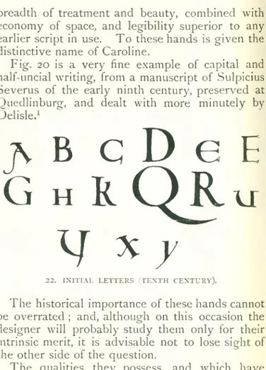
Fig. 20 is a very fine example of capital and half-uncial writing, from a manuscript of Sulpicius Severus of the early ninth century, preserved at Ouedlinburgf, and dealt with more minutely by Delisle.1
j\ B c
D
e E
G
h
R Q R u
I J X y
2 2. INITIAL LETTERS (TENTH CENTURY).
The historical importance of these hands cannot be overrated ; and, although on this occasion the designer will probably study them only for their intrinsic merit, it is advisable not to lose sight of the other side of the question.
The qualities they possess, and which have already been indicated, and the immense influence and prestige which the imperial support given to
3 0
Alphabets.
Delisle (Ch.), “ Mém. sur l’école caligraphique de Tours iècle.” Paris (1885).
3
i
Tours procured for its productions, rapidly ex tended throughout the civilized world ; and it may be shortly stated that the Caroline lettering thus originated, became the basis from which all other European hands were developed until the inven tion of printing, and even then the immediate authority for the shape of many of the types— a matter treated more fully in its place further on.
The period extending from the reign of Charle magne to the thirteenth century was a time of transition. The standard Caroline hand, in diffe rent parts of the empire, gradually developed in different directions, so as to again acquire varying national characteristics ; but at the same time, with a general tendency to loss of breadth, and substitu tion therefor of a regular angularity ; so that to wards the end of the twelfth century was produced the class of letters to which the name of Gothic has by pretty general consent been given, and which reached in the following century its greatest perfection.
During this period also further important changes took place. The use of capitals became more extended ; and in the hands of the minia turists acquired great importance, and underwent much variation of form ; so that from this cause arise many alphabets of initials widely differing— apart from all question of ornamentation— from the standard forms in use. It is, however, to be borne in mind that, with such unimportant varia tions of proportion or treatment as the fancy of individual scribes dictated, the square Roman
W ß
0(GrOÜ
1J»
> 0 ( 0Jfl
fl/ e jp
6 1 1/ K g m i i o o
p B ^ i r r
24- i n it i a l l e t t e r s (n in t h c e n t u r y). D
capitals properly so-called, remained constantly in use, and are often of great elegance.
Another important point is the superior legi bility obtained by increased space between separate words.
The depth and solidarity of the Roman in fluence is shown in nothing to so great an extent as in the persistency of the characters used by their scribes, among all the nations at one time or another under the rule of the empire. All writing was in the hands of two classes only; and church men combined with law-men to maintain in their integrity the symbols in which doctrine and pre cept had been handed down to them. So long as Rome was mistress she dominated the world of letters ; with the dispersion of her power into new centres, smaller, influenced by new men and new ideas, and affected by local circumstances in entirely new directions, it would have been rea sonable to expect the rapid growth of a whole series of alphabets, differing widely and radically from each other. This, however, did not by any means happen ; the conservatism of the literary classes was so strong, that not until the thirteenth century do we find essential changes in the in trinsic form of letters, other than the gradual growth of ornament at the hands of the illuminators and miniaturists ; and that expansion, so to speak, and facility which naturally accompanied the practice of an increasing literary cultivation.
By the thirteenth century, then, a new series of alphabets had arisen out of the ruins of the Caroline minuscule. The curves by slow degrees
jrBCf;o^>
3efe|
£p P (J (.') <; G
h
t i f l>
h
X r J J K
U
i ö ) in (
ü
r r R p N o
o
yp JR R R ^
f ,V T ti l i y V
’y / j r y ~X
25- VERSALS (TWELFTH CENTURY MS.).
N
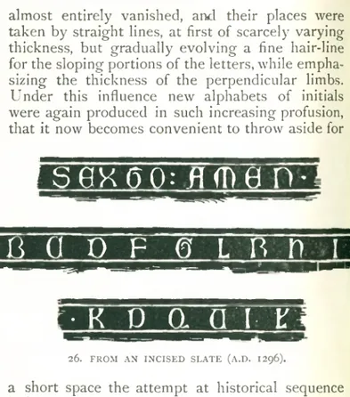
almost entirely vanished, and their places were taken by straight lines, at first of scarcely varying thickness, but gradually evolving a fine hair-line for the sloping portions of the letters, while empha sizing the thickness of the perpendicular limbs. Under this influence new alphabets of initials were again produced in such increasing profusion, that it now becomes convenient to throw aside for
36
A Iphabets.
SflXflQ: flfflfl
Fl-fS Cl O F © L f t n I
5 1
:• K P Q n T T
26. FROM AN INCISED SLATE (A.D. 1296).
a short space the attempt at historical sequence hitherto maintained, and consider some examples of alphabets of the later middle ages as they arise, with more particular reference to their intrinsic merit and the peculiar circumstances affecting them.
Fig. 26 is a nearly complete alphabet of so- called Lombardic capitals, such as were especially used for inscriptions in metal and stone, taken from the monument of Nenkinus de Gotheim,
P itL íM
R (Tí)
© M R
I H X U t V
S ¥
UWX:
-7- f r o m a n i n c i s e d b r a s s (A.D. 1 3 2 7 ) .dated 1296, in the church of the little village of Gothem in Belgium.
Of great simplicity and boldness, its suitability to the material, slate, in which it is cut, is at once evident. The letters are of unequal merit, the R being perhaps the w eakest; but they will be found to combine well, a quality too often over looked in considering an alphabet piecemeal. And
38
A Iphabets.
tatutf
mftruttmm antjuluni ocujCtrualoti.
X
l - O
i p
- C
1 ^ 0 - t Z c Pp X
-Tffiufo ponnfimXe feoti Cmin Drifiteummus
^ptfiripus ftrmfiDpozcnf^ ozDmis ftanum
pOtcatm. 3rmo Dm
& t £ c x x ) W i -erftut
contpUtn quintal )umi.
28. FROM A MANUSCRIPT (A.D. 1436).
the unusual rotundity of many of the curves, as for instance in X and K , arises from the necessity of avoiding as far as possible, sharp angles of incidence, which in slate would be liable to chip away.
An example of somewhat later date is illustrated in fig. 27, for purposes of comparison with the last specimen. These letters, also Lombardic in character, are taken from a Swedish brass of somewhat later date (1327) in the church of
39
The M iddle A ges.
Vester Aoker near Upsala. The difference in treatment arising from the substitution of metal for stone is very noticeable. In the latter, the fanciful curves made use of in A (a letter curiously approaching the Roman form, and on that account not to be used without care), G, and other letters, would of course have been, if not impossible, at all events of little practical value. The characters also combine very effectively.
With the two foregoing examples may not unpro- fitably be placed the alphabet of capitals illustrated
ABCffFGUM
H
0P
9RSTWX
29. FROM A SPANISH MS. (EIGHTH CENTURY).
in fig. 28, taken from a manuscript in the Biblio thèque Nationale at Paris. The date of this writing is 1436.
It has been already pointed out that the square Roman capitals persisted throughout all other changes and developments. But in many cases, while preserving their form, they acquired a certain characterization which is well worth attention. This was especially the case in Spain, where the Latin influence was more powerful than elsewhere ; but where, on the other hand, it came in direct contact with the marvellous decorative instinct of
40
the Moors. All Spanish writing has a peculiar quality, which must be attributed to these two causes. The letters suggest sometimes the mag nificent severity of old Saracenic inscriptions; sometimes the timid grace of early Christian grave inscriptions. Of the latter class is fig. 29, an alphabet taken from a manuscript of the eighth century— somewhat out of its order here, perhaps, but so placed with a view to its derivatives, or at all events successors, rather than its own merits. It shows some curious variants from accepted
ABCDGPGH
5KL
s c m
w x
30. FROM A SPANISH MS. (TWELFTH CENTURY).
standards. D, E , Q, and U, all deserve study— the form of N is often met with at the time, and is one which might well be revived for decorative purposes ; indeed, the whole alphabet commends itself very strongly to this end.
Fig. 30, also from a Spanish manuscript, is of later date, having its origin in the twelfth cerrtury. This is simply a mixture of capitals and uncials, but still with much the same character as the last example.
1
he H seems somewhat incongruous, but the other curved letters appeal forcibly to us by their beauty and simplicity. It is essentially a title-page alphabet, as modern uses go.The M iddle A ges.
41
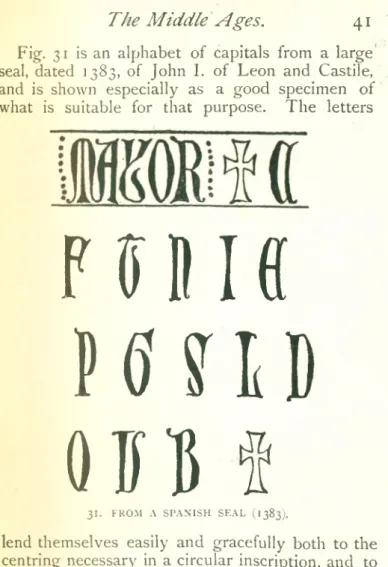
Fig. 31 is an alphabet of capitals from a large seal, dated 1383, of John I. of Leon and Castile, and is shown especially as a good specimen of what is suitable for that purpose. The letters
P 0 Iff
H U B
Q B B §
31. FROM A SPANISH SEAL (1383).
lend themselves easily and gracefully both to the centring necessary in a circular inscription, and to combination with each other ; while they are suffi ciently bold and well defined to give a clear and unmistakable impression. A feature to be ob served, in addition, is the mutual protection ob
tained by massing letters in this manner on the outer edge of a seal, and the harmony of the style with the heraldic devices which will almost invariably occupy the centre, a point so often overlooked by modern die-sinkers.
Fig. 32, a portion of the dedicatory inscription of the Cathedral of Toledo, is a good specimen of what may be done in the way of variation, contrac tion, or linking up of the Hispano-Roman capitals ; practices which were too often carried to great excess, to the confusion of modern paleographers, but which here appear not to go beyond the limits of artistic taste and legibility.
So far, very little reference has been made to the cursive, or ordinary running hand, as opposed to the book-hands of the manuscript writers. And for the most part the subject is beyond the scope of this book, being quite too dependent on individual idiosyncrasy, as well as too illegible and uncertain in form for modern use. But, out of it, gradually arose the various écritures diplomatiques—the scripts used by the Papal and other Chanceries, the charter-hands of royal courts, and the legal “ engrossing” hands, which still linger with us. A few of these demand a passing word, and it may best, perhaps, be said before losing touch with those alphabets of the mediaeval ages from which they separated.
A s a script with a distinctive character of its own, diplomatic writing, as we may for convenience term the whole class, made its first appearance in the Papal Chancery about the end of the eighth century. It was a round, legible hand ; not