TOMASZ WALENTA — FIRST-PERSON NARRATIVE SUMMARY
Polish-Japanese Academy of Information TechnologySPIS TREŚCI
I — EDUCATION AND PROFESSIONAL WORK
Education 1
Professional experience - teaching 1
Professional experience - freelance 2
Professional experience - company employment 2
II - BIOGRAPHY
Canada 1983-1996 3 Poland 1996-1999 4 Canada 1999-2005 6 Poland-Canada 2005-2015 8 PhD 2.0 9III — DOCUMENTATION AND DESCRIPTION OF ARTISTIC ACHIEVEMENT
List of achievements constituting a scientific or artistic accomplishment referred to in art. 16 sec. 2 of the Act of March 14, 2003 14 Signs, visual language and editorial illustration 14Mind & Matter 16
Works constituting my artistic achievement 23
Participation in international and national artistic events 78 Participation in international and national publications 78 Participation in international museum collections 78
Participation in competitions 79
BIBLIOGRAPHY
ANNEXES
Annex 1 — Personal data Annex 2 — PhD
Annex 3 — List of artistic achievements realized since PhD graduation Annex 4 — Portfolio dydaktyczne
I — EDUCATION AND PROFESSIONAL WORK
Education
Philosophiae Doctor (PhD) — 2016
UQAM, Fine Arts Department. Interdisciplinary Studies and Practices of Arts. Title: L’image qui parle: Étude de la pratique du langage visuel pour le graphiste et l’illustrateur éditoriali.
Doctoral advisor: prof. Marc H. Choko
Master of Arts — 1999
Academy of Fine Arts in Warsaw, Graphic Design Department. Practical advisor: Prof. Lech Majewski
Theoretical advisor: Prof. Anna Lewicka-Morawska
Bachelor’s — 1995
Graphic Design, UQAM.
Professional experience - teaching
Polish-Japanese Academy of Information Technology (www.pja.edu.pl) > Assistant Professor — Applied Visual Semiotics
> Assistant Professor — Design Practice > Assistant Professor — Design Practice II
> Assistant Professor — Research Methods for Designers > Assistant Professor — Project Management
> Lecturer — Visual Semiotics — Winter 2017-2018 > Lecturer — Film Semiotics — Winter 2017-2018 > Lecturer — Design Practice — Winter 2017-2018 > Lecturer — Visual Information — Winter 2017-2018
Uniwersytet UQO w Ottawie, Kanada (www.uqo.ca/emi) > Lecturer — Poster Design — Autumn 2015
> Lecturer — Introduction to Typography — Autumn 2015
Uniwersytet UQAM w Montrealu, Kanada (www.design.uqam.ca) > Lecturer — Introduction to Graphic Design — Autumn 2013 & 2014 > Visiting Professor — Poster Design — Summer 2011
> Assistant — Introduction to Graphic Design — Autumn 2005 > Lecturer — History of Graphic Design — Winter 2004 & 2005 > Assistant — History of Graphic Design — Winter 2003
Uniwersytet ULAVAL w Quebecu, Kanada (www.design.ulaval.ca) > Lecturer — Editorial Illustration — Autumn 2002
Workshops
> Visiting Professor, School of Form, Poznań — Poster Design — Winter 2018 > Visiting Professor, Intuit.lab, Paris — Poster Design — Winter 2006 > Visiting Professor, Atelier Autograf, Paris — Poster Design — Winter 2006
i- The Talking Image: A Study of the Practice of Visual Language for the Graphic Designer and Editorial Illustrator.
Professional experience - freelance
Independent graphic designer and illustrator represented since 2001 in the United States by Marlena Agency (marlenaagency.com). Clients: Time magazine, Foreign Policy, The New Republic magazine, The Boston Globe, The New York Times, The Chicago Tribune, The Washington Post, OLAM Magazine, The Wall Street Journal, Forbes Magazine, The Progressive, Columbia Journalism Review, Oxford University Press, Sunday Magazine, Harvard Business Review, Scholastic, The National Post, The Scientist, Yale School of Public Health, Walrus Magazine, Nautilus Magazine, etc. Independent graphic designer and illustrator in Poland. Clients: Dziennik, Newsweek, FUTU, Przekrój, Dziennik Gazeta Prawna, Wpost, Magazyn Podróże, Magazyn Pismo, Instytut Adama Mickiewicza, Muzeum Żydów Polskich, Porcelana Kristoff.
Professional experience - company employment
ORANGETANGO, Montreal, Canada (www.orangetango.com) Graphic Designer — From March 2000 to July 2000
Art Director — From July 2000 to February 2001
SIDLEE, Montreal, Canada (www.sidlee.com) Web Designer for Cirque du Soleil, 2002
SAATCHI & SAATCHI, Warsaw, Poland (www.saatchi.com/pl) Junior Art Director — Summer Practice, 1997
II - BIOGRAPHY
Canada 1983-1996
I was born in Warsaw in 1974. In 1981, I left with my parents to Switzerland, from where in 1983 we emigrated to Canada. I spent my childhood in Montreal. I had French-speaking friends, I felt like a real French-Canadian.
When I was 15 years old, I saw a Polish poster hanging in the window of a gallery on Montreal’s St-Denis Street. It was the poster Policja by Mieczyslaw Gorowski. That day, I fell in love and decided that I wanted to become a graphic designer. My first contact with graphic design was in 1991, when I graduated from secondary school and enrolled at Collège Jean-de-Brébeuf — a Jesuit university-preparatory school — and started to study Visual Communication. During the two years I spent in this school, I discovered and experimented with drawing, painting, sculpture, photography, film and basic typography. At the end of the two years, I created my first portfolio and applied with success to the graphic design department of Université du Québec à Montréal. I was accepted without an interview, which was an honor, considering that there were about sixty applicants for one seat.
I spent the next three years discovering the different fields of graphic design; typography, illustration, animation, magazine design, book design, design for the early internet, poster design, packaging design, etc. I can honestly say that I enjoyed and was competent in all these different sub-disciplines, but my favorite disciplines were illustration and poster design. So much so, that I volunteered to create posters for student associations.
As I was studying and as my vision of who I wanted to become was getting clearer, I decided that once I completed my bachelor’s degree, I would return to Poland to study at the Academy of Fine Arts in Warsaw — the birth place of the Polish poster. This was my dream and goal at the time. I felt a very strong connection with Polish poster artists. I was constantly exploring the works of Tomaszewski, Górowski, Lenica, Starowieyski, Świerzy, Młodożeniec, Cieslewicz, Sadowski, etc. They were my masters and I felt that I could also become a Polish poster artist.
After graduating and obtaining my bachelor’s degree, in the spring of 1996, I decided that I would work all summer in order to save money for my studies in Warsaw. I got a first day job as a junior graphic designer at a small Montreal studio called Fly Graphics and a second night job as a coachman in Old Montreal, offering horse-carriage rides to tourists. These two jobs allowed me to save enough money to buy a computer, a scanner and a one-way plane ticket from Montreal to Warsaw.
Policja, poster by Mieczysław Górowski, 1989.
Poland 1996-1999
I arrived in Warsaw in September 1996. Shortly after settling in, I took my portfolio and went to the Academy of Fine Arts to apply for master’s studies. With a smile, the secretary, Janka Piotrowska (“Pani Janka”), informed me that I had missed the recruitment period and that I had to reapply the next year. Also with a smile, I refused to take no for an answer. I explained my situation and I showed her my bachelor’s diploma and portfolio. After looking at my works, she asked me to wait in the hall while she talked with the Dean, Stanisław Wieczorek. After waiting for a while, I was informed that the Dean was open to my request, but under one condition. I had to present my portfolio to every master studio professor (painting studio, drawing studio, specialization studio). If all the professors accepted me in their studios, I would be allowed to enroll in the master’s program.
I don’t really know how I managed to be accepted in the painting and drawing studios of professors Grzegorz Pabel and Hubert Borys — I had no paintings and academic drawings in my Canadian portfolio, all I had were illustrations — fortunately they accepted me.
I chose the Graphic Publishing Studio of Professor Lech Majewski as my specialization studio. I knew he was tough, but I felt that I had to be in his studio if I wanted to fulfill my dream of studying poster design at Warsaw’s Academy of Fine Arts.
After looking at my work, Majewski said to me: “You have talent, but you have to forget everything you’ve done and learned until today. You have to stop trying to be a Polish poster designer, you are a happy Canadian. Here, you will learn who you really are, you will discover yourself.”
The beginnings were difficult, as it is difficult to forget everything that one has learned. I also had many problems with the theoretical classes, like History of Art and Philosophy because I had never spent a single day in a Polish school. In order to write the required papers in Polish, I had to teach myself to read and write.
Illustrations created in my “Polish” style during my Bachelor studies, Montreal, 1993-1996.
In Majewski’s studio, I kept hearing about “idea synthesis”, “visual shortcuts”, “visual language”, but I did not fully understand what these words meant. Only after more than a year and many failures did I finally understand what Majewski wanted to convey. I learned how to build images using visual signs. I found my own graphic style and for the first time since I started studying in Majewski’s studio, I started to enjoy myself. As Majewski had promised, I discovered myself. In parallel to studying full time at the Academy of Fine Arts, I was also working full time as a graphic designer on Poland’s newly open market. In the 1990s, this market was an eldorado for graphic designers who knew how to use a computer. I worked for many clients, designing everything from business cards to magazines. This is how I supported myself and how I learned a great deal about printing and graphic design production.
In 1997, I was offered a paid internship at Saatchi & Saatchi Warsaw. I was hired as a junior art director during the summer. This experience was interesting because it made me realize that I could never work in an advertising agency. I had my first graphic success in 1998, when my poster Happy New Year, created in Majewski’s studio, was selected to be part of the 16th International Warsaw
Poster Biennale.
In June of 1999, I graduated from the Academy of Fine Arts in Warsaw. I wrote my dissertation titled Dada and Typography under the supervision of Professor Anna Lewicka-Morawska. My practical diploma project titled Welcome XXI, created under Lech Majewski’s supervision, was an installation of ten life size characters (197 cm tall like me) depicting social and political realities of the 20th century.
I returned to Canada in December 1999.
Happy New Year, poster, 1998. My first poster in my “real style”.
Canada 1999-2005
Returning to Montreal after completing my master’s degree was always my plan. I felt more Canadian than Polish and I believed that I could have access to more interesting work in Canada than in Poland. My objective at the time was to design theater posters for Montreal’s many theaters, but I had no contacts in this community. Fortunately, I found a job in a small studio called Orangetango owned by Mario Mercier, a renowned Montreal designer and his business partner Annie Lachapelle. Orangetango was oriented towards the cultural market, designing books, magazines, annual reports, identity systems, websites and posters for Montreal’s cultural institutions. Since our team was very small — only three designers — I had the chance to work in-depth on many different projects. I was in charge of designing an entire architecture magazine Ai for The Canadian Centre for Architecture (CCA), I worked on books, cultural websites and posters. Working for Orangetango taught me a great deal, especially in regards to typography and opened many doors for me.
Thanks to Orangetango’s accountant, David Lavoie, I met a group of comedians that were starting a politically engaged theater group — Les Zapartistes. They asked me if I wanted to design their posters. They had absolutely no budget, so, I had absolute freedom! In the beginning of our collaboration, their financial situation was so bad, that they could only afford to pay for large format black and white photocopies. I got around this problem by creating stencils and adding color to the black and white photocopies with spray paint. It was a toxic process because of the fumes (working in the basement of a cafe during the winter) but, I managed to produce around 25 posters (100 cm x 140 cm) for each show. Eventually, with their growing success, we were able to print our posters in silkscreen.
This experience launched my poster career in Montreal. In the following years, other theaters and institutions asked me to design their posters. To this day, I have contracts in Montreal thanks to the posters I designed for Les Zapartistes. I always wanted to be a freelancer — I am not an 8 to 4 person. To become independent, I was planning to transpose the logic of poster design to editorial illustration. Designing cultural posters gave me the perfect opportunity to start my first illustration portfolio.
In the beginning of 2001, Orangetango merged with another graphic design studio. The number of employees jumped from 5 to 25, the workload changed, the atmosphere changed, it was time to leave. I quit my job, but managed to keep one client who was also dissatisfied with the merger — the architecture magazine Ai. This client allowed me to become a freelancer.
During the next six months I worked on Ai, on my illustration portfolio and I was hired as a freelance web designer by Diesel (Seedlee today), a young dynamic design agency. We worked on the first Cirque du Soleil (Cirque du Soleil is a Canadian entertainment company and the largest theatrical producer in the world — Wikipedia) website pitch (proposal), and after winning the pitch, on the Cirque’s first website.
First poster for Les Zapartistes, 2001.
Poster for the National Film Board of Canada, 2004.
In June 2001, my first illustration portfolio was ready and I started contacting illustration agents in the United States. I received two positive answers, one from San Francisco that didn’t pan out, and a second one from New York’s Marlena Agency. Marlena Agency’s owner, Marzena Torzecka, a Polish emigrant living in New York at the time, told me that she was interested in representing me, but that I wasn’t yet ready. She asked me to create illustrations on themes she would send me, in order to build a stronger portfolio.
Every week, for the next six months, she would send me a story or give me a subject. Until, one afternoon, the phone rang, it was Marzena. She told me that she had good news and bad news. The good news was that she had found my first contract, that it was a cover illustration for The New Republic Magazine, that it was well paid, and that if I succeeded in publishing my illustration, she would start representing me. The bad news was that it was for tomorrow morning, and that if I failed to publish my illustration, I would have to find myself a new agent. I have been working with Marzena for the past 17 years.
By April 2002, I was a freelancer working as a web designer, a magazine designer, a poster designer and as an editorial illustrator represented by a New York agency. Later the same year, I was approached by the Laval University in Quebec City to teach an editorial illustration class during the fall semester of 2002. In parallel, I was starting my PhD studies at Université du Québec à Montréal in the Arts Studies and Practices program. My initial thesis was titled: The Influence of History on the Work of Polish Poster Designers of the 1945-1989 Period.
During the same period, I was invited by my former professor to do a review of posters designed by his students. Shortly after the review, he offered me a job. I started working at my home University (UQAM) in January 2003. During the first year, I was hired as an assistant for the History of Graphic Design class. In 2004, I was promoted to lecturer for the same class. I taught the History of Graphic Design for two years (2004-2005). In 2005, I also became an assistant in the Introduction to Graphic Design class.
My PhD studies were advancing, and in the fall of 2005 I traveled to Poland to conduct interviews and collect data for my thesis.
Ai magazine, 2000.
The New Republic cover, 2002.
Poland-Canada 2005-2015
I landed in Warsaw in October 2005 with the objective of conducting my PhD research. Instead, I started a family. This changed all my plans and my entire life. I moved to Poland, dropped out of my PhD studies and I abandoned my work at the university in Montreal.
From 2006 to 2011, I continued to work as a graphic designer and illustrator, but I left academia aside, except for two poster workshops that I conducted in Paris in the winter of 2006.
During this period, I created more than 200 illustrations for the American market, more than 200 illustrations for the Polish market and at least 20 posters. On the American market, I started a four-year weekly collaboration with Time Magazine (2011-2015 — 163 illustrations) and other clients like The Washington Post, The Boston Globe and The Wall Street Journal. On the Polish market, I had the opportunity to work weekly for Dziennik creating a total of 108 illustrations. I worked regularly for Podroze Magazine from 2006 (2006-2018 — 117 illustrations), for Newsweek Poland from 2008 (2008-2014 — 97 illustrations), and occasionally for Przekroj Magazine and Wprost Magazine.
I came out of my academic hibernation in 2011 when I was invited to teach a poster workshop at my former university in Montreal. Following this experience, I decided to complete my PhD. I reapplied in 2012 and started to study again in 2013 after 7 years of absence. It took me 3 years to complete my studies, during this time, I lived in-between Warsaw and Montreal. My renewed PhD studies allowed me to reconnect with the academic community. I was hired again as a lecturer to teach Introduction to Graphic Design at UQAM (2013-2014), and Poster Design and Introduction to Typography at the Université du Québec en Outaouais (2015).
PhD 2.0
As I mentioned above, my original PhD (2002-2005) thesis was about the turbulent history of Poland, my country of origin, and its influence on the Polish poster designers of the 1945-1989 period. After restarting my studies 7 years later, I felt the need to change this subject. By working at my profession, I left aside the past and I have focused on the present and the future. I became a professional, I developed my style and my ability to express complex content. My new PhD subject was the result of 15 years of work as a poster designer and editorial illustrator. During those years, I created freely without questioning the theoretical foundations of my works. I produced posters and editorial illustrations without really understanding the mechanisms underlying my creation. My instinct, my imagination and my sensitivity were the only tools I had to structure my images. Over time, however, I began to see logic in my work. I noticed a common thread, I understood that there was a structure behind the instinctive act of creation. My curiosity to discover this structure and the desire to understand and to name the instinctive led me to redefine my research subject. By exploring a subject that stems directly from my work and experience, I felt sincere in my writings, because their source lied in my practice.
My new PhD research question was: “What is the structure of visual language behind my practice as a poster designer and editorial illustrator?” My new PhD title was: The Talking Image: Study of the Practice of Visual Language for the Graphic Designer and Editorial Illustrator.
My PhD is the work of a working professional, not a theorist, and it is addressed to working professionals, not theorists. It is written in a simple and accessible language. Much of what I propose is based on my own reflections and my intuitions. The theoretical framework I used helped me to understand and name certain linguistic and semiotic concepts. It helped me to order my thoughts and to anchor my reflection. It inspired me and demystified certain principles that I suspected of existing, but which I had not clearly identified.
I want to clarify these facts in order to be perceived and understood for who I am. I am an image creator, a graphic designer specializing in the design of posters and editorial illustrations and I am a reflective practitioner. My readings were tools used to better understand what a language is and its constituting elements, but they have not defined the content that I conveyed. This content is fundamentally rooted in my experience as a working professional and lecturer. It is by observing the reality of the market in which I work and the reality of young people orienting themselves towards this market that I have defined the topics I wanted to convey. I created a text that was missing when I made my first steps and when I did not fully understand what my professors were asking of me. My ambition was to facilitate access to visual language that can serve the individual expression of any interested person.
My PhD is composed of two volumes. In the first volume, I present the conceptual and visual elements of visual language, I explain its working principals, I describe my practice and my profession, and I conclude with a case study that provides an overview of my work and creative processes. The second volume is a repertory of 250 signs which can be used for the expression of varied concepts. This directory can be used as a source of inspiration or as a tool to widen the visual vocabulary of anyone who wants to communicate with images.
For me, learning visual language was trial and error and took a considerable amount of time. Unfortunately, there is no “manual of visual language”. There are, of course, books that deal with this subject. However, they come from theorists, like Roland Barthes, Fernande Saint-Martin, Catherine Saouter or Umberto Eco, to name only a few. Having read these texts, I can say that they are mainly addressed at art historians or researchers. These are texts that present the receiver’s point of view and offer interpretations and ways of decoding and analyzing images. They are complex texts written in a language that is often difficult for the professional. These texts are certainly interesting and rich in meaning, but in my opinion, they do not offer tools for image creation.
To remedy this situation, I proposed a vision from the point of view of the professional, the transmitter, focused on the creation of images and whose purpose is to help the construction of these images. If I compare a graphic designer to a chef, I can say that the graphic designer creates an image as the chef creates a dish. This dish can be analyzed after the fact to try to guess its ingredients. However, it would be much easier to ask the chef for the recipe. In the same way, it is possible for an art historian or an art researcher to guess the “ingredients” of an image, but wouldn’t it be simpler to speak directly to the artist who has created the image?
This analogy, I believe, is a good illustration of the problem I am considering. Being an image creator or somehow a “chef”, I am able to explain my approach and my work methodology. My goal was to pass on my knowledge and experience by identifying clearly and precisely the “ingredients” of my works and the process that led me to their creation. In doing so, I address students and professionals who also want to compose graphic “dishes”.
There are, to my best knowledge, no tools for students and professionals directly addressing the concepts behind visual language. There is no book explaining the rules and elements of this language and offering a structure and terminology accessible to the graphic arts students and professionals. The publications I have found, explore the technical concepts of graphic design (typographic rules, composition rules, construction of graphical grids, etc.), but do not address the issues that interest me.
L’image qui parle: Étude de la pratique du langage visuel pour le graphiste et l’illustrateur éditorial and L’image qui parle: Répertoire, 2015. Book covers.
Theoretical Point of View: Semiotics
Visual language has its source directly in the theory of signs. That is why the semiology of Ferdinand de Saussure and the semiotics of Charles Sanders Peirce underlie my theoretical references.
The authors who have inspired me the most are Charles Sanders Peirce, Gérard Deledalle, Joëlle Rethoré and Jean-Marie Klinkenberg. It is thanks to them that I have a growing interest for semiotics, which I intend to deepen in future research.
Methodology
The research I conducted focused on visual language in my poster and editorial illustration practice. My PhD presents a point of view of a reflective practitioner.
“It is a researcher who examines the realities of his professional practice. He reflects, he does not think about the theoretical who does not know how to do it. The basis of the action itself. Of course, to be able to speak theoretical. Professional knowledge obeys another question and another approach: the reflexive approach.” (Schön, 1996, p. 14)
My objective was to explore my practical knowledge, to understand and explain the realities of my practice (Bruneau and Villeneuve, 2007). My writings are based on the heuristic approach inspired by Moustakas (1990). They are articulated according to the principles of initial engagement, immersion and incubation, enlightenment and explanation, as well as creative synthesis and validation. My reflections were partly realized “after the action” (Schön, 1983/1994), in order not to interrupt the creative process. But also “in the action” (Saint-Arnaud, 2001), during planned creative sessions. I distinguish these two approaches in order to underline that my reflection is not limited to a retroactive analysis, it also includes an analysis during the moment of creation. These two ways of looking at my work are for me complementary and agree with the objective of a search for processes in action (Bruneau and Villeneuve, 2007). My methodology was hybrid, taking advantage of the heuristic method (Moustakas, 1990) and the reflexive practitioner method (Schön, 1996 and Saint-Arnaud, 2001). I was inspired by these two methods to conduct my research and I adapted them to the specific needs of my subject. I used the heuristic method as a general framework and took advantage of the reflexive practitioner’s method to define the particular actions.
L’image qui parle: Étude de la pratique du langage visuel pour le graphiste et l’illustrateur éditorial, 2015.
The object of my research was a catalog of samples selected from my works. My research was based on sign theory as well as on my observations gathered in my journal of practice.
The catalog of samples consisted of posters and editorial illustrations, they were considered samples from the perspective of the process that engendered
them and were analyzed both as a whole and individually, in accordance with the principle of Schleiermacher’s hermeneutic circle (Molino, 1985, 96):
“A text is understood only by recourse to all the texts, and the set of texts is understood only by the comprehension of individual texts; it is indeed an antinomy of the particular and the general, the whole and the part...” All works were considered as a series in which the general structure of visual language was visible. Each individual work was a window on the different peculiarities of this language.
My methodology also included an element that allowed me to test my conclusions. This element was to have and regularly refer to someone who acted as an independent external analyst — a reviewer who in an objective and critical way addressed my work.
My external analyst was Andrée Kahlmorgan, art director of TIME magazine in New York. I worked with Andrée every week for four years (from May 2011 to June 2015). My task was to illustrate the column of Joel Stein, a commentator of American reality. During these years, I have learned a lot about mainstream illustration and market reality. Andrée led me through these years and taught me a great deal about my work and the elements of visual language. She was an invaluable ally who allowed me to rigorously carry out my research.
L’image qui parle: Répertoire, 2015.
Poland 2015-Present Day
After deposing my PhD thesis in December 2015 at l’Université du Québec à Montréal, I returned to Warsaw. I continued to work as a graphic designer and editorial illustrator, and I started to look for academic work in Poland. I was hired as a lecturer in October 2017 by dr. hab. Ewa Satalecka from The Polish-Japanese Academy of Information Technology at the New Media Art Department and was promoted to adjunct professor in May 2018. I am presently responsible for four subjects; Applied Visual Semiotics, Design Practice (editorial illustration and poster design), Research Methodology for Designers, and Project Management (creative process management).
III — DOCUMENTATION AND DESCRIPTION OF ARTISTIC ACHIEVEMENT
List of achievements constituting a scientific or artistic accomplishment referred to in art. 16 sec. 2 of the Act of March 14, 2003
According to the formal requirement, aspiring to meet the conditions specified in art. 16 sec. 2 of the Act of 14 March 2003 on academic degrees and academic title and on degrees and title in the field of art, I present as my artistic achievement a series of 54 editorial illustrations related by subject under the common title:
Mind & Matter, created for The Wall Street Journal, between 2016 and 2019.
The presented achievement and its description are a window through which you can look into my workshop, to get a glimpse at my profession and my reflections. I am an editorial illustrator, in my career I have created over 1,500 illustrations published around the world. My work is, from an artistic point of view, quite specific, it is based on the interpretation of “someone else’s” subjects — I do not choose the subjects of my illustrations, they are accidental. Sometimes I get a text that I relate to, sometimes one with which I have nothing to do and which is seemingly completely uninteresting. I never know what I will be working on tomorrow. My task is to create an illustration in the shortest possible time. I maintain a neutral attitude toward the themes that I illustrate, I treat each of them as an intellectual challenge or solving “puzzles” on how to represent something that cannot be represented. How to represent the Higgs boson that no one has ever seen? How to represent political changes in South Africa? How to represent artificial intelligence or human memory? The pleasure in my work results from the satisfaction of a solved “puzzle”. This is an intellectual pleasure. The challenge in my work is not to draw but to find a mental shortcut reflecting the idea of the text.
In the first part, I describe the context and process that allows me to solve my “puzzles”, in the second part, each of the 54 illustrations.
Signs, visual language and editorial illustration
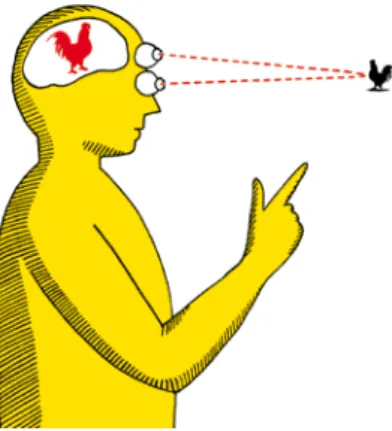
According to Charles Sanders Peirce, a sign functions on three levels.
“I define a sign as something that is so determined by something else, called its object, and therefore determines an effect on a person, which effect I ca l l its interpretant, that the latter is thereby immediately determined by the first.” (Peirce et Deledalle, 1978, p. 51).
A visual s i gn must be approached on three levels: on the pragmatic1, the
conceptual and the formal levels. In short, a visual sign is an image that triggers meaning in a (cultural) context.
Communicat i on through images, the iconic message (Group μ, 1992), is a construct of visual signs that interact to make a message appear. These signs are the building blocks of visual language.
1- Pragmatics is a branch of linguistics that is concerned with the relationship of sentences to the environment in which they occur. (Merriam-Webster)
My philosophy of image creation is based on my belief that any form of visual art can be viewed through the prism of language. When we express ourselves in a natural2 language, we use words from the language’s vocabulary and apply
grammar rules, particular to this language, to arrange these words — linguistic signs — into sentences that can express content literally, narratively, humoristicaly, conceptually, metaphorically, poetically and abstractly.
The same principle applies when we create images. The only difference is that in this case, the “words” we use are visual signs and the language we “speak” is visual language Images are “visual sentences” composed of visual signs structured according to a grammar particular to a medium.
I think that visual language is like any other language, it has a vocabulary, a grammar and can express various concepts on various levels.
From my point of view, a poster by Henryk Tomaszewski, an editorial illustration by Christoph Niemann, a painting by Caravaggio, a sculpture by Alberto Giacometti and an animated film by Tim Burton are all constructs of visual signs chosen within the vocabulary of visual language (iconic and formal) and arranged into a coherent whole by applying each medium’s particular grammar.
What we see when looking at different mediums (2D, 3D, 4D) is ultimately an image on our retina, we perceive everything as an image, therefore a sculpture is perceived as an image and a movie is perceived as a sequence of images. All the images we perceive consciously or unconsciously, form our visual vocabulary and all visual mediums draw from this common vocabulary.
Editorial illustration is one of these mediums. It’s a graphic work printed in a newspaper or a magazine. It is of small format and its main objective is to express a concept. Editorial illustration complements a text written by an author. An editorial illustration is part of a layout where it occupies a well-defined space. Its role is to attract the reader’s attention and promote the text it accompanies. An editorial illustration is based on the main idea of the text it accompanies. Its purpose is to transpose the concept evoked in this text into an image. It is important to understand that the primary objective of an editorial illustration is not aesthetic, it’s communication. As Krzysztof Lenk puts it so well 3 — writing
about posters but, in my opinion, also about editorial illustration (2003, p. 8): “In thinking posters, form does not appear as an intrinsic value, but rather plays a subordinate role, subordinated to the idea. It has its origin in the idea and the metaphor or sign chosen by the author, so it is built as if from the inside-out.” [translation from the author]
Nevertheless, it is certain that a clearly articulated message and a pleasing aesthetic form are desirable. A good editorial illustration must please the viewer. It must be able to stimulate him intellectually and aesthetically by surprising or confusing him. By paraphrasing Group μ (1992), it must be a “caress of the neurones”.
2- Natural language: a language that is the native speech of a people (as English, Tamil, Samoan). (Merriam-Webster)
3- “W plakatach myślących forma plastyczna nie występuje jako wartość samoistna, a raczej pełni rolę służebną, podporządkowaną nadrzędnej idei. Ma swój początek w pomyśle plakatu i wybranej przez Authora metaforze czy znaku, jest więc budowana jakby od środka – na zewnątrz.”
Mind & Matter
I chose to name my artistic achievement Mind & Matter because it’s the name of the original column I started illustrating in 2015. Today, things have changed, during the last years (2017-2018), the column has grown; there is the main “Mind & Matter” column, the “Susan Pinker Mind & Matter” column, the “Alison Gopnik Mind & Matter”, the “Everyday Physics” column, the “Everyday Math” column and the “Wilczek’s Universe” column. I work for all of them. Since we started our weekly collaboration in 2015, I have created more than 130 illustrations for the “Mind & Matter” column “family” and I have chosen 54 of them for my achievement.
I have occasionally been working for The Wall Street Journal for more than seventeen years. I had the pleasure of collaborating with many great art directors like Susan McDermoth, Derick Gonzalez, Pete Hausler, Marlene Szczesny, Keith Webb and lately Kelly Peck.
In 2015, I started receiving regular commissions for the Journal’s “Mind & Matter” column, a column dedicated to formal, natural and social sciences. The subjects I illustrate are usually very abstract and vary a great deal from week to week (for example algorithms, child psychology, memory, a black hole’s “hair”).
I illustrate the texts of different authors like Susan Pinker (a psychologist and author), Robert M. Sapolsky (a neuroendocrinologist and author), Helen Czerski (a physicist, oceanographer and television presenter), Frank Wilczek (a theoretical physicist, mathematician and Nobel laureate), Melvin Konner (a professor of Anthropology and Neuroscience and Behavioral Biology), Alison Gopnik (a professor of psychology and affiliate professor of philosophy), and Eugenia Cheng (a mathematician and pianist).
At first, I was commissioned to create static illustrations that would be published both in the paper and the internet editions of the Journal, but since early 2017, I have started to animate my illustrations for the online edition. Animation offers a greater storytelling potential than static illustration and is in-line with today’s technology and my client’s needs.
The Work Context and Process
My job consists of creating original images. This process always begins with a “source”. This “source” can be an event that I observe in everyday life, in the media, or it can come from a client. Unlike a professional who realizes the vision of the client, I am a professional who offers his own vision to the client. In other words, my job is to invent new solutions. The client uses my services not purely for aesthetic or technical reasons, but for my interpretation on a given theme. The commission in this context is not defined as such. There are no directives or imposed directions. The client expects me to interpret a given subject and find original solutions. Hence the notion of “source”. The “source” can be a play, a film script, a novel, a title, a concept, or in this case an editorial text. Here are the general stages of my work process:
1- Reception of the commission
I receive 99% of my commissions by email. It can be an email from my agent or directly from a client.
2- Preliminary evaluation of the commission
This is when I decide if I accept the commission or not. This decision depends solely on my availability. I never refuse commissions for thematic reasons because I believe that working on a variety of themes is my best way of expanding my visual vocabulary.
3- Accepting the commission
The acceptance of the commission is done by a return of email. This confirms that I have indeed accepted the commission and allows a first contact with the art director.
4- Reading and analyzing the content of the commission
After accepting the commission, I analyze the “source” (reading the text, the synopsis, the instructions of the client, etc.).
5- The ideation
The most important part in my work process is the search for ideas, that is, conceptual work. It is for this step that I reserve the most time. Once I find my ideas, I start working on sketches. My search for ideas is based on my analysis of the theme to illustrate.
6- The realization of presentation sketches
I always try to do a minimum of two sketches for difficult themes, and five to seven sketches for simpler themes. My sketches are very detailed. I have developed this way of working for two reasons: 1- a strong sketch guarantees that there will be no unpleasant surprises when sending the final illustration to the client; 2- by making advanced sketches, I build a quasi-final image bank allowing me to resell these images to other clients wishing to illustrate a similar theme.
7- Reception of the art director’s feedback on sketches
In most cases, the art director’s feedback is simply the choice of one of my sketches. By producing several sketches, I give many choices to my client. I try to explore all possible “angles” by presenting different approaches. I developed this way of working to avoid having to start over. It is risky to present only one or two sketches, as it may well be that we miss the target that the client had in mind.
8- The realization of the final illustration
The realization of the final illustration is for me the simplest step. All the work (drawing, composition, choice of colors, etc.) has already been done during the sketching phase.
9- Reception of the art director’s feedback about the final illustration
Generally, at this stage, the art director’s feedback is limited to thanking me for my work. Sometimes, but very rarely, he asks me to make a small correction.
Sketches and final, “Mind & Matter” Column, The Wall Street Journal, 2015.
If so, they are minor and require almost no effort.
The process I have just described is the result of many years of work. It’s a process based on efficiency and speed of execution, two realities of the market. I apply it as much for poster design as for editorial illustration, and it works just as well in both cases. I have also created a detailed Practical Work Methodology that can be seen in Annex 5.
I apply the above method when working on the “Mind & Matter” illustrations. Every Monday or Tuesday I receive a story by e-mail. From that moment, I have roughly six hours to work on ideas and sketches. I usually create three different sketches for each story trying to approach the subject from different angles (see Annex 5: 5.2 & 5.3).
Once I am happy with my sketches, I send them to my art director Kelly Peck — Kelly presents my ideas to the Journal’s entire editorial team, to the editor-in-chief, the other editors, and the design director. Most weeks, she replies with the Journal’s choice, her answer usually looks like this: “The winner is #3. Please sent the finals when you can.”
If all goes this well, the next step is to work on the static final illustration and then, on the animated version. I usually have between six and twelve hours to deliver both finals. But sometimes, things do not go so well. On rare occasions, Kelly asks me to send new sketches. This can happen because I missed an angle or because the Journal’s editorial team has a different vision for the artwork. In this scenario, I simply work on additional sketches keeping in mind the publication deadline. My illustration is published on Thursday morning in the online edition and on Saturday in the print edition of the Wall Street Journal.
Since I have completed my PhD, I have come to realize that my creative process is based on the translation of content expressed through natural language, into visual language. I could go so far as to say that I do not consider myself an editorial illustrator, but a translator. My work is always based on a concept that is expressed with words and my objective is to create an image that expresses this same concept. I transpose linguistic content into visual content.
The problem I face with every commission reveals itself on three levels: on the pragmatic, the conceptual and the formal levels. These are the same levels as the ones on which visual signs function. Since editorial illustrations are built with visual signs, and that visual signs function on three levels, the process of creating editorial illustrations must also logically function on the same levels. The pragmatic level refers to the interpretation of a given image both by its creator (me) and the receiver of the image (client, target audience).
Understanding the pragmatic level as a whole (the client) and individually (each story) is a dynamic process. After working weekly for more than two years for the “Mind & Matter” column, I can say that I have a good understanding of the pragmatic level as a whole, in other words, I understand how my client wants to address his target audience. But every week, I have to adjust to the individual
pragmatic level of each story.
The pragmatic level is the first level that concerns me because it’s the foundation for all subsequent decisions (conceptual and formal). I start every project by defining the pragmatic level in which my image must function. It allows me to understand the creative context I work in; what visual signs I can use within my visual vocabulary and what style I should work in.
Generally, The Wall Street Journal has a conservative editorial line and a huge target audience4. These facts determine the editorial content and aesthetics of
the Journal. For me, this means that my illustrations must be “aesthetically conservative” (rather realistic, positive, bold, colorful, etc.) and that they must be conceptually accessible (literal rather than conceptual, simple, direct, politically correct, etc.).
Specifically, there are two kinds of stories that function on different pragmatic levels. A story about physics, psychology or mathematics will function on a different pragmatic level than a story about PTSD, suicide or genocide. In the first case, the subject is neutral, in the second delicate. In the first case, my objective will be to show as directly as possible the subject of the story. In the second case, my objective will be to hide the subject of the story behind a metaphor. I can interpret the “neutral” story literally, narratively, humoristically, conceptually, metaphorically, poetically or abstractly. But it’s hard to imagine interpreting the subject of genocide in a humoristic or literal way. The visual signs I have at my disposal for the “neutral” story, are all the visual signs that are coherent with the story. On the other hand, the visual signs I have at my disposal for the “delicate” story, are limited to visual signs that won’t in any way shock the client and his target audience. I usually dismiss signs signifying death, violence or conflict because they are “pragmatically incorrect” for this client — which doesn’t mean that they are not suitable to express the story’s concept.
Once the pragmatic level is evaluated and understood, it’s fairly simple to define the conceptual and the formal levels.
The conceptual level is always determined by the subject of the story. The main idea of the story is the main idea of the illustration. The difficulty here, is to determine this idea. I always read the story at least twice and I always summarize it in one sentence. This sentence is a synthesis of the story, it contains all the elements that I will later translate into visual language.
Once I know exactly what I want to say, my work consists of selecting the visual signs — presumably intelligible and pragmatically acceptable by my client and his target audience — that allow me to express the story’s main concept. The last step is imagining an original way of using these signs in order to create a strong image. This is the most interesting step, it’s where the ideas for the images emerge. My creative process is based on the heuristic approach inspired by Moustakas (1990). It’s articulated around the principles of initial commitment, immersion and incubation, enlightenment and explanation, as well as creative synthesis and validation.
4- The Wall Street Journal is one of the largest newspapers in the United States by circulation, with a circulation of about 2 475 000 copies (including nearly 1,590,000 digital subscriptions) as of June 2018. - Wikipedia
Do Stars Really Have Points? A “neutral” subject, “Mind & Matter” Column, The Wall Street Journal, 2019.
Inheriting the Trauma of Genocide. A “delicate”, subject “Mind & Matter” Column, The Wall Street Journal, 2019.
When working on ideas for an illustration for the “Mind & Matter” column, I must take into consideration that my illustration will be animated and that the animation must loop. When looking for visual signs that I could use in my illustration, I always verify if these signs have animation potential, if they don’t, I eliminate them.
Idea finding Process
1- Once I have summarized my source into one sentence, I begin by identifying at least one primary visual sign that will be the underframe of my illustration. To determine this sign, I analyze the sentence to identifying primary, secondary and subsequent concepts. For example, if I have to illustrate a story about psychology and my sentence is: “(Different types)2 of (memories)1 (reside in different areas)2 of the (brain)1”. The primary concepts (1) are “memories” and “brain” — this is what the story is about. To me, this means that I will need a visual sign that signifies “head” or “brain” — because that is where memories are located. But, by understanding the pragmatic level on which this image must function, I also know that I can’t use the image of a brain — the client simply doesn’t like brains. This doesn’t mean that I can’t suggest a brain, it means that I can’t draw one. At this point, I don’t yet know what visual sign I will use to signify “memory(ies)”.
2- Next, I think of a second primary visual sign that will allow me to build meaning based on the first primary visual sign. To determine this/these sign(s), I take into account the primary visual sign I chose in the previous stage and I look for consistent signs. The second primary visual sign is a sign that allows the message to be specified on the basis of the general context. To continue our example, I think of the second primary visual sign that can signify “memory (ies)”. To find this sign, I mentally go through my visual vocabulary (the feeling is similar to when you are looking for a word that you can’t remember) and I look for visual signs that can signify “memory(ies)”. If there are no visual signs that can directly signify the concept I’m trying to transmit — like in our example — I start looking for a metaphor. In this case, I thought of the metaphor of the drawer to signify “memory”. At this point, I was also able to confirm that this illustration could be animated — because drawers can open and close. Drawers can also be multiplied...
3- When I have the first two primary visual signs and I was able to generally signify what I have to convey, I begin to look for signs that will allow me to express the secondary meaning. The secondary meaning (2) is information that complements the primary meaning. To determine this/these sign(s), I take into account the primary visual signs I chose in the previous stages and look for consistent signs. In our example, it’s quite obvious to multiply the drawers to signify “different areas” and adding a second secondary compound5 visual sign
— five different colors — to signify “different types”.
4- By understanding the pragmatic level on which this image must function, I know that the illustration should signify a positive atmosphere. Therefore, I make my character smile and I use saturated colors.
5- Compound visual sign: a visual sign consisting of at least two visual signs.
Illustration about memory, “Mind & Matter” Column, The Wall Street Journal, 2018.
I determine the formal level based on the pragmatic and conceptual levels by adjusting the style of the illustration — sometimes I draw, sometimes I mix drawing and photographic elements and sometimes I create photo-illustrations. I find that the more complex the pragmatic and conceptual levels, the simpler the formal level. On the conceptual level, I try to always find the simplest possible solution to express a given concept, I apply this same logic on the formal level, I render my illustrations in the simplest way possible, eliminating effects, decorations and other superfluous elements. This is in line with the teachings of Henryk Tomaszewski as quoted by Schubert (2008, p. 41-42):
“In my workshop, I bring my students to think logically and coherently. I give them a theme and I expect them to reject, by way of analysis, all that is superfluous in order to arrive at a «visual shortcut». By «visual shortcut», I understand the condensation of the form, the condensation of the subject. I am used to leaving aside their judgments and all unnecessary forms of frills. I force them to asceticism, I prefer a crude expression to an excessively extravagant expression. I advocate a personal and autonomous expression, an expression that stimulates the imagination. I force them to discover themselves.”
The last step of the process is animating the illustration. When the animation is complex (many characters walking, for example) this step can be very time consuming. Since I have a strict timetable and stiff deadlines, I must be careful when proposing ideas to my client. Sometimes, I reject an idea because the amount of work that would be required for animation is unrealistic. I also try for the animation to be coherent with my style — I consider my work to be rather minimalistic — therefore I look for fairly simple animation solutions. I am also limited by technical factors, my files must be GIFs6 and their size must be kept to
a minimum (less than 2 MB).
Animating my illustrations is one of the most interesting ways of making my work evolve. I am generally happy with my ideas and my graphical style, but I find that static images in our technological era are simply outdated. Why settle for a static image when it can be animated? I think that even printed illustrations should have an animated version accessible through augmented reality (see page 23). Even the simplest animation adds communication potential to an illustration. Being able to unfold a concept in time, allows for more content to pass, it also allows greater flexibility when working on complex concepts. In our example, I animated nine of the thirty drawers in our character’s head. Conceptually, animating the drawers accentuates the “different types in different areas” concept, formally, it makes the illustration ”come to life”.
I go through a similar process every week. With each new story, I have to find a new solution. There are great weeks and not so great ones. Some subjects lend themselves better than others to illustration. The main difficulty in working for the same client over la long period of time is in keeping a stable quality level independently of the subject, the timeframe, and life in general. I find that my
Animation frames, “Mind & Matter” Column, The Wall Street Journal, 2018.
9- GIF: The Graphics Interchange Format, is a bitmap image format that was developed by a team at the online services provider CompuServe led by American computer scientist Steve Wilhite on June 15, 1987. It has since come into widespread usage on the World Wide Web due to its wide support and portability. — Wikipedia
practical methodology allows me to be quite stable.
My reflection on twenty years of practice as a graphic artist and editorial illustrator at on the international market is my main source of knowledge as an educator. Since the completion of my PhD, I continue to study the semiotics of visual language, analyzing not only my own works, but also the works of other graphic artists and illustrators, as well as the logical and creative processes necessary for their creation.
The fruit of this research is — as of today — a series of lectures and workshops named Applied Visual Semiotics, addressed to first-year art students.
I start with lectures on semiotics, because it is the basis of every form of communication. The students gain universal and flexible knowledge applicable to any form of artistic expression. By understanding the intrinsic logic of language, the students will be able to adapt to any culture, to any subject and to any medium.
The creative process is intuitive and implicit. Developing an awareness of its elements allows for greater control and stability in creative work. I complete my theoretical lectures with workshops in which students learn to identify their own creative processes.
I strongly believe that my classes bring many benefits to students. They give them confidence and greater control over the creative act, they allow them to enrich and develop their visual vocabulary and facilitate conscious expression. I think that it’s more than a coincidence that since October 2017, eight of them stood out at international competitions (see Portfolio dydaktyczne - Annex 4). I am a reflective practitioner. My ability to theorize allows me to create knowledge rooted in practice and contemporary market realities. I offer students a functional point of view aimed at their artistic and intellectual development. I believe that this ability is my most important achievement and my contribution to the development of the field.
Below I attach the descriptions of all 54 illustrations.
Illustration on string physics, “Mind & Matter” Column, The Wall Street Journal, 2019.
Works constituting my artistic achievement
The titles of the illustrations are titles given by The Wall Street Journal.
I have chosen the presented illustrations because of their diversity and representativeness. They show my flexibility in meeting the needs of my client. All illustrations and animations are 100% mine.
All online illustrations have been published in the following formats: > 1024 px. x 810 px. > 900 px. x 471 px. > 553 px. x 369 px. > 359 px. x 239 px. > 262 px. x 174 px. > 120 px. x 90 px.
The illustrations for the paper edition are 8 in. x 8 in. (the art director adjusts the format of the illustration to the page layout).
Place of realization/distribution of all illustrations: the United States
The nimated illustrations can be viewed using the augmented reality application “HP Reveal” for smartphone. After installing the application and logging in, you should “Follow” the twalenta account.
Applications are available free of charge at these addresses: https://apple.co/2V7xr4V
http://bit.ly/2U96eT7
The animated versions of the illustrations are also visible here:
1 - WHAT AI IS STILL FAR FROM FIGURING OUT
Publication date: March 20, 2019Author: Alison Gopnik
Story synopsis: “Machines have gotten better at applying rules, but will they ever match humanity’s ability to come up with new ideas?” (WSJ)
My synthesis: AI is limited.
I created 4 sketches for this project. The client chose sketch #3.
Solution: I used the metaphor of the box to express the concept of being limited. The robot (AI) is drawing a box around himself.
2 - DO STARS REALLY HAVE POINTS?
Publication date: March 6, 2019 Author: Helen CzerskiStory synopsis: “We think stars are spiky because of technology: It’s how they appear when their light is diffracted through a camera aperture.” (WSJ)
My synthesis: Light diffraction makes us see stars with spikes when in fact they are round.
I created 6 sketches for this project. The client chose sketch #5.
Solution: I used the image of a camera aperture and a star to illustrate the story. In the animated version, the aperture opens and closes and the star changes its shape from round to pointy.
3 - INHERITING THE TRAUMA OF GENOCIDE
Publication date: February 21, 2019 Author: Susan PinkerStory synopsis: “Research shows that atrocities witnessed by Tutsi survivors in Rwanda can leave marks on their children, born years later.” (WSJ)
My synthesis: The transmission of a negative experience from parent to child.
I created 3 sketches for this project. The client chose sketch #1.
Solution: This was a “delicate” story. I used a parent and a child holding hands to emphasize their relationship and to allow the transmission of the cracks from parent to child.
4 - THE ‘STICK-SLIP’ BEAUTY OF BOW AND STRING
Publication date: January 30, 2019Author: Helen Czerski
Story synopsis: The story discusses the physics behind vibrating surfaces in order to explain how violin music and squeaky door hinges work.
My synthesis: Vibrating elements create sound waves.
I created 10 sketches for this project. The client chose sketch #9.
Solution: After seeing my first sketches, the client asked me to incorporate the violin’s sound wave in the illustration. This image is a literal interpretation of the story.
5 - AGGRESSION IN BOYS IS A FAMILY MATTER
Publication date: January 24, 2019Author: Susan Pinker
Story synopsis: “A new study of children shows that problematic behavior can be identified in infancy, if not before, by looking at their background and circumstances.” (WSJ)
My synthesis: Angry child.
I created 3 sketches for this project. The client chose sketch #1.
Solution: This was a “delicate” story. This image is a literal interpretation of the story, but anger is shown graphically with an “aggressive” red shape.
6 - BLACK HOLES MAY HAVE ‘HAIR’ THAT WE CAN SEE
Publication date: January 3, 2019Author: Frank Wilczek
For this illustration, I didn’t get the full story, only a few lines from the author. Story synopsis: “Quantum mechanics challenges the traditional view that nothing escapes from a collapsed star.” (WSJ)
My synthesis: A black hole with hair.
I created 5 sketches for this project. The client chose sketch #5.
Solution: this image, in one way or another, had to show a black hole with hair. I created five different versions of this image.
7 - FOR GORILLAS, BEING A GOOD DAD IS SEXY
Publication date: November 30, 2018Author: Alison Gopnik
Story synopsis: “Most male mammals don’t spend much time with their offspring. What makes silverbacks—and humans—so different?” (WSJ).
My synthesis: Silverback gorilla taking care of young.
I created 3 sketches for this project. The client chose sketch #2.
Solution: this image is a literal interpretation of the story. I showed a gorilla and his offspring in a humoristic manner.
8 - GOING WITH THE FLOW OF TRAFFIC
Publication date: November 9, 2018 Author: Eugenia ChengStory synopsis: “The right equations can help solve congestion by treating cars on a road like fluid in a pipe.” (WSJ)
My synthesis: Car traffic is like a liquid.
I created 3 sketches for this project. The client chose sketch #2.
Solution: this illustration is a literal interpretation of the story. The image is interesting because of the effect of surprise created by the scale of the cars compared to the faucet and pipe.
9 - WHEN IT COMES TO SLEEP, ONE SIZE FITS ALL
Publication date: October 25, 2018Author: Susan Pinker
Story synopsis: “A massive new study shows that every adult needs 7-8 hours a night, or else their cognitive abilities will suffer.” (WSJ)
My synthesis: Relationship between sleep and cognitive abilities.
I created 5 sketches for this project. The client chose sketch #2, but asked me to make the man a woman.
Solution: To signify the idea of sleep, I used a woman wearing sleeping goggles resting her head on a pillow and a dark blue color theme. To signify a lack of sleep, I drew the woman with wide open eyes, creating a strong contrast between the white of the eyes and the overall color of the illustration. To signify lowered cognitive abilities, I used an icon of a discharged battery in the area of the woman’s brain.
10 - WHEN A BETTER NEIGHBOURHOOD IS BAD FOR BOYS
Publication date: September 26, 2018Author: Susan Pinker
Story synopsis: “Research shows that when poor families move into more expensive housing, girls’ lives improve while boys’ get worse. What explains the difference?” (WSJ)
My synthesis: When moving, boys are more fragile than girls.
I created 4 sketches for this project. The client chose sketch #2.
Solution: I interpreted this story literally, I used a “fragile” sticker on the box the boy sits in contrast with the girl’s box where there is no sticker.
11 - THE MAGIC MICROBUBBLES OF THE BARISTA
Publication date: September 6, 2018Author: Helen Czerski
Story synopsis: The physics of coffee bubbles. My synthesis: Coffee bubble structures.
I created 6 sketches for this project. The client chose sketch #3.
Solution: For this project, I had a very precise element to show — the coffee bubbles. To show their mechanics or physics, I used cogs as a metaphor of a precise and complex system. The round shapes of the cogs and of the coffee bubbles were a perfect match.
12 - AN UNFORGETTABLE MEMORY EXPERT MUSES AT 100
Publication date: August 23, 2018Author: Susan Pinker
Story synopsis: This story was about Brenda Milner, a British-Canadian neuropsychologist celebrating her 100th birthday. Milner is most famous for her
finding that different types of memories reside in different areas of the brain. My synthesis:
> The 100th birthday of Brenda Milner (since my client sometimes likes to
include photographs of famous people in illustrations, I can do a portrait.) > Brenda Milner is a great woman.
> The scientific findings of Brenda Milner (different types of memories reside in different areas of the brain).
I created 5 sketches for this project. The client chose sketch #4.
Solution: The story being about memory — a function of the human brain — I used a head and concentrated on the area of the brain. In order to depict that “different types of memories reside in different areas of the brain”, I used the metaphor of the drawer to signify memory, and different colors as a metaphor of diversity.
13 - SWIMMING ON ATOMIC AND COSMIC LEVELS
Publication date: August 9, 2018Author: Frank Wilczek
Story synopsis: “Reflections on how bacteria, cats, divers and an unlucky astronaut in ‘2001’ move through air, water and outer space.” (WSJ)
My synthesis: Swimming with different elements of the story (bacteria, particles, waves, etc.).
I created 4 sketches for this project. The client chose sketch #1.
Solution: I created a scene where a swimmer and other elements swim together. This illustration is a literal interpretation of the story.
14 - FOR BABIES, LIFE MAY BE A TRIP
Publication date: July 18, 2018 Author: Alison GopnikStory synopsis: “The minds of infants are a mystery, but new brain research suggests that their inner lives may resemble a dream or a psychedelic trip” (WSJ). The story discusses what it is like to be a baby, but since it’s impossible to ask babies directly, it focuses on studies comparing the brain waves of adults in different states of consciousness to the brainwaves of babies.
My synthesis:
> An adult trying to find out what it’s like to be a baby. > A baby in a dream like or hallucinogenic state.
I created 3 sketches for this project. The client chose sketch #3.
Solution: this image is based on the babies’ expression and the psychedelic background to suggest that the baby is in a different state of consciousness.
15 - A CRASH COURSE IN SUMMER THUNDERSTORMS
Publication date: June 27, 2018Author: Helen Czerski
Story synopsis: “What’s behind the rumble of thunder? The science of ice pellets, plasma heated to 52,000 degrees and sound in the shape of a lightning bolt.” (WSJ)
My synthesis: The causes of the sound of thunder.
I created 5 sketches for this project. The client chose sketch #1.
Solution: I interpreted this story literally, but I replaced the lightening bolt with a sound wave.
16 - NEW SKILLS BUILD NEW BRAIN ARCHITECTURE, RESEARCH SHOWS
Publication date: June 14, 2018Author: Susan Pinker
Story synopsis: How learning to read alters the brain and “very recent evidence that the brain’s structure can change when human beings — in this case, dyslexic children — learn a new skill.” (WSJ)
My synthesis: Positive impact of reading on children’s brain.
I created 4 sketches for this project. The client chose sketch #2.
Solution: in order to show that reading positively influences children’s brain structure, I used a growing flower as a metaphor. A child is shown reading and a flower grows in his head.
17 - BEHIND SPARKLING WHITE UNIFORMS, AN OPTICAL TRICK
Publication date: May 24, 2018Author: Helen Czerski
Story synopsis: “Uniforms of cricket and baseball players rely on brighteners, additives that can minimize the effects of stains.” (WSJ)
My synthesis: Optical brighteners make uniforms look white.
I created 6 sketches for this project. The client chose sketch #6.
Solution: This is a literal interpretation of the story. I used contrast between white and the colors of the rainbow. In the animated version, the ball bounces between the illustration’s frame and the cricket bat.
18 - THE BEST WAY TO THINK ABOUT PROBABILITIES
Publication date: may 17, 2018Author: Eugenia Cheng
Story synopsis: “It’s hard to transfer a sense of likelihood from large data sets to individual events in real life. Eugenia Cheng’s advice on how to deal with chance, from medical forecasts to elections.” (WSJ)
My synthesis: “Good” and “bad” statistics.
I created 6 sketches for this project. The client chose sketch #5.
Solution: I used the percentage sign (%) and I replaced one “circle” with a happy face and the other with a sad face. In the animated version, both “circles” alternate - from happy, to sad.
19 - CURIOSITY IS A NEW POWER IN ARTIFICIAL INTELLIGENCE
Publication date: May 4, 2018Author: Alison Gopnik
Story synopsis: “In developing AI, scientists are starting to look to children for inspiration.” (WSJ)
My synthesis:
> Learning as a game. > AI as a “child”.
I created 3 sketches for this project. The client chose sketch #2.
Solution: in this illustration, I simply replaced a child in a playful context by a “robot child” signifying AI.